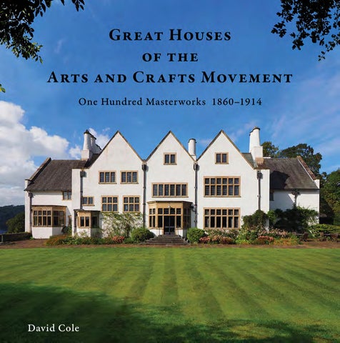
Regarded as the first Arts and Crafts building, designed by the father of the architectural movement and built for, appropriately, William Morris, Red House is the most revered – and the most extensively written about –house of the Arts and Crafts Movement.
Philip Speakman Webb (1831–1915)1 was born in Oxford, the second son of eleven children of Charles Webb, a doctor, and M. Elizabeth Webb née Speakman. His importance in the course of the Arts and Crafts Movement over the following forty years has already been discussed (see pp. 19–21). 2 Webb commenced his articles in 1849 with John Billing (1816–63) in Reading, Berkshire, and after a brief period with the Wolverhampton firm of Bidlake and Lovatt, he returned to Oxford in 1854 to work for the diocesan architect, George Edmund Street, who soon appointed Webb as his chief assistant. It was in January 1856, that Webb first met his future lifelong friend William Morris, then training to be an architect, who had just joined Street’s office, and whose training Street had put under Webb’s supervision. Later that year, Street moved his office to London, where, through Morris, Webb began associating with the circle surrounding the Pre-Raphaelite Brotherhood, in particular Morris’s friends Dante Gabriel Rossetti and Edward Burne-Jones. Morris left Street’s office in 1858, intent at the time on changing his career to painting, and Webb left the following year to set up his own practice – and to design Red House for Morris. It was in this fervent youthful atmosphere of high art and new beginnings, and in Morris’s case the newness of a pending marriage, that Webb and Morris created Red House: Morris’s ‘Palace of Art’, as he liked to refer to the dream of his own home.3
Morris married Jane Burden in Oxford in April 1859,4 and for the site on which to build their new marital home, Morris had purchased an old orchard in the hamlet of Upton, near Bexley Heath in Kent. The property was close to the London-to-Canterbury Pilgrims’ Way from Chaucer, and, more practically beneficial, it was about 3 miles from the Abbey Wood railway station for trips to London. Importantly, Morris’s brief to Webb would have been not only for a future family home, but also a house in which Morris could work as a painter, and which would be suitable for
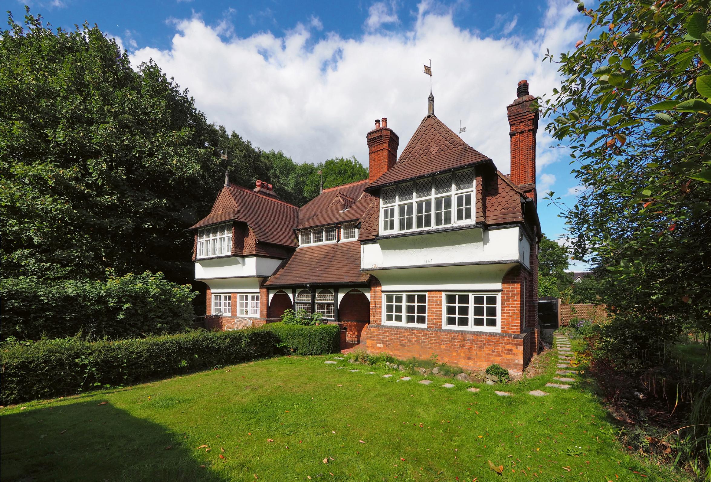
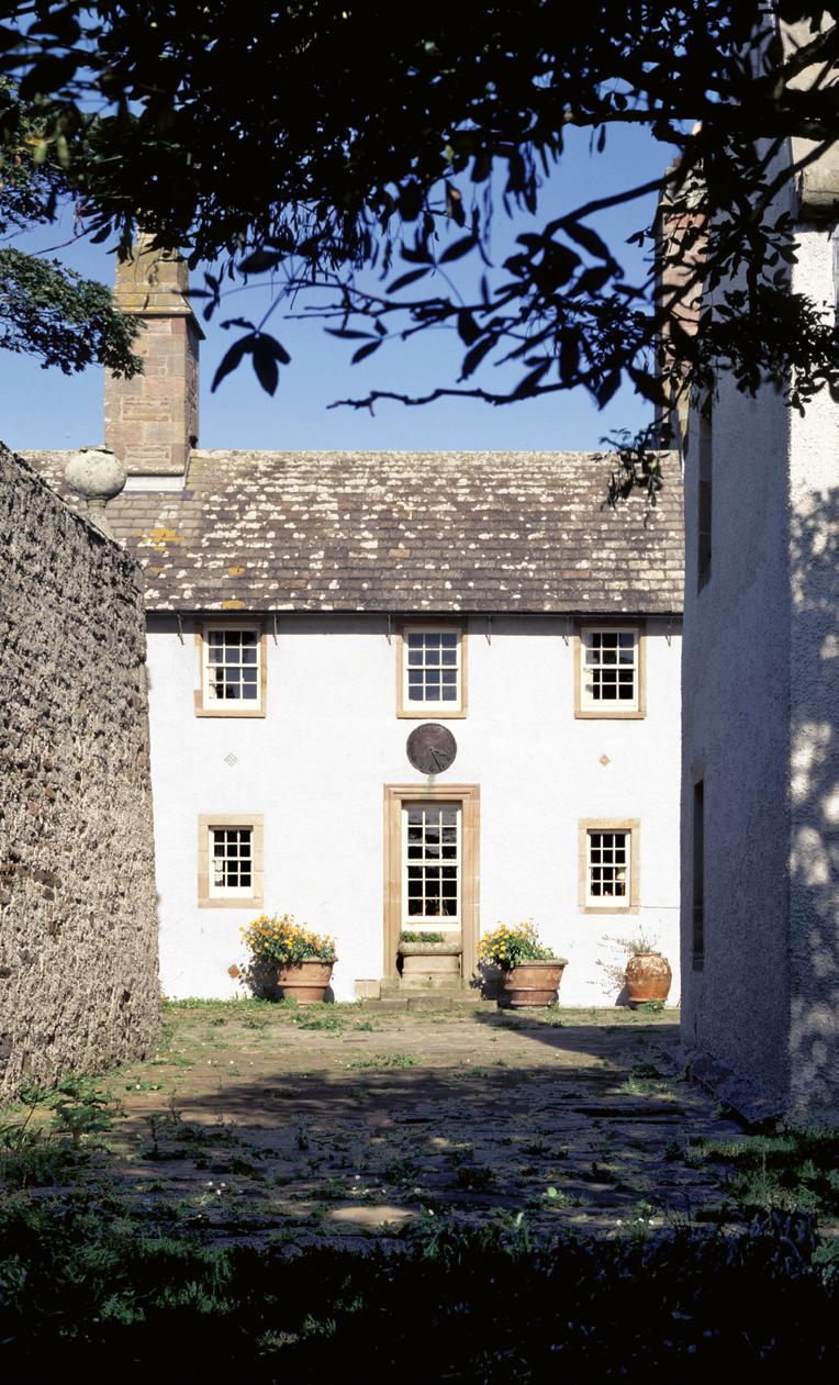
LEFT The iconic south-east view of Red House, the most enduring view of any Arts and Crafts house, showing its orchard garden setting, the bold single red-brick materiality, the picturesque profile of the steep pitched-roof ridges, the seemingly random distribution of window openings, and the abiding architectural influence of Gothic Revival rectories and cottages past
Kent, 1872
Oast House
Philip Webb
Philip Webb matured as an architect through the decade following the completion of Red House, in the development of his professional skills, the measured growth of his architectural practice and the mature application of his craft.1 Most significantly through this period, Webb’s convictions and commitment to an architecture that was true and faithful to its place and its local traditions became fully formed. 2
In strong contrast to his illustrious contemporary Richard Norman Shaw, Webb maintained a small office staff, and typically only accepted one or two commissions at any one time.3 Having set up his first office in Great Ormond Street in London in 1859, after leaving Street’s office to design Red House, subsequently in 1864, Webb moved to rooms in Gray’s Inn, where he would remain for the rest of his career.4 During this first decade of his practice, Webb completed some eight new country house projects of varying sizes (sadly, most of which were destroyed over the next century), as well as several urban residential and commercial projects.5 An ongoing interest for Webb through this period was his continuing partnership with Morris and their fellow co-founders in the interior furnishing company Morris, Marshall, Faulkner & Co. 6
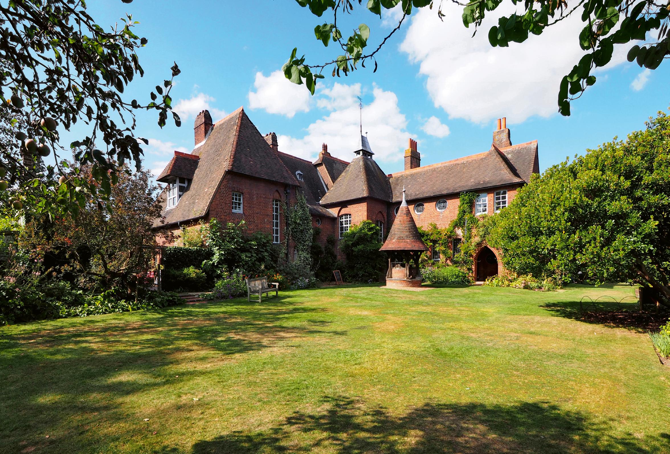
Oast House was designed for an aristocratic client, Lord Sackville Cecil (1847–98), a railway and telegraph engineer by profession.7 The house was built on a sloping wooded site in old West Kent. Webb orientated the house on a north/south axis along an elevated ridge, with the principal rooms facing south and east, service spaces in the north section of the house, closer to the road, and the front entrance incorporated centrally into the west of the floor plate. Webb’s floor plan was a typically functional and efficient layout, with a central hall connecting directly to the main stair and to all three main ground-level rooms: the south-facing study, the south- and eastfacing drawing room, and the east-facing dining room. For purposes of his work, Cecil’s brief called for a basement laboratory, which Webb designed as a brick-vaulted structure served by an octagonal spiral stair tucked discretely off the entry hall. Upstairs, the main bedrooms were strategically configured, similar to the main downstairs rooms, with the outside walls of the two main south-facing bedrooms set back from the overhanging roof in order to form a balcony to each room.8 Webb’s interior designs were simple, yet exquisitely
Cumbria, 1878
Four Gables
Philip Webb
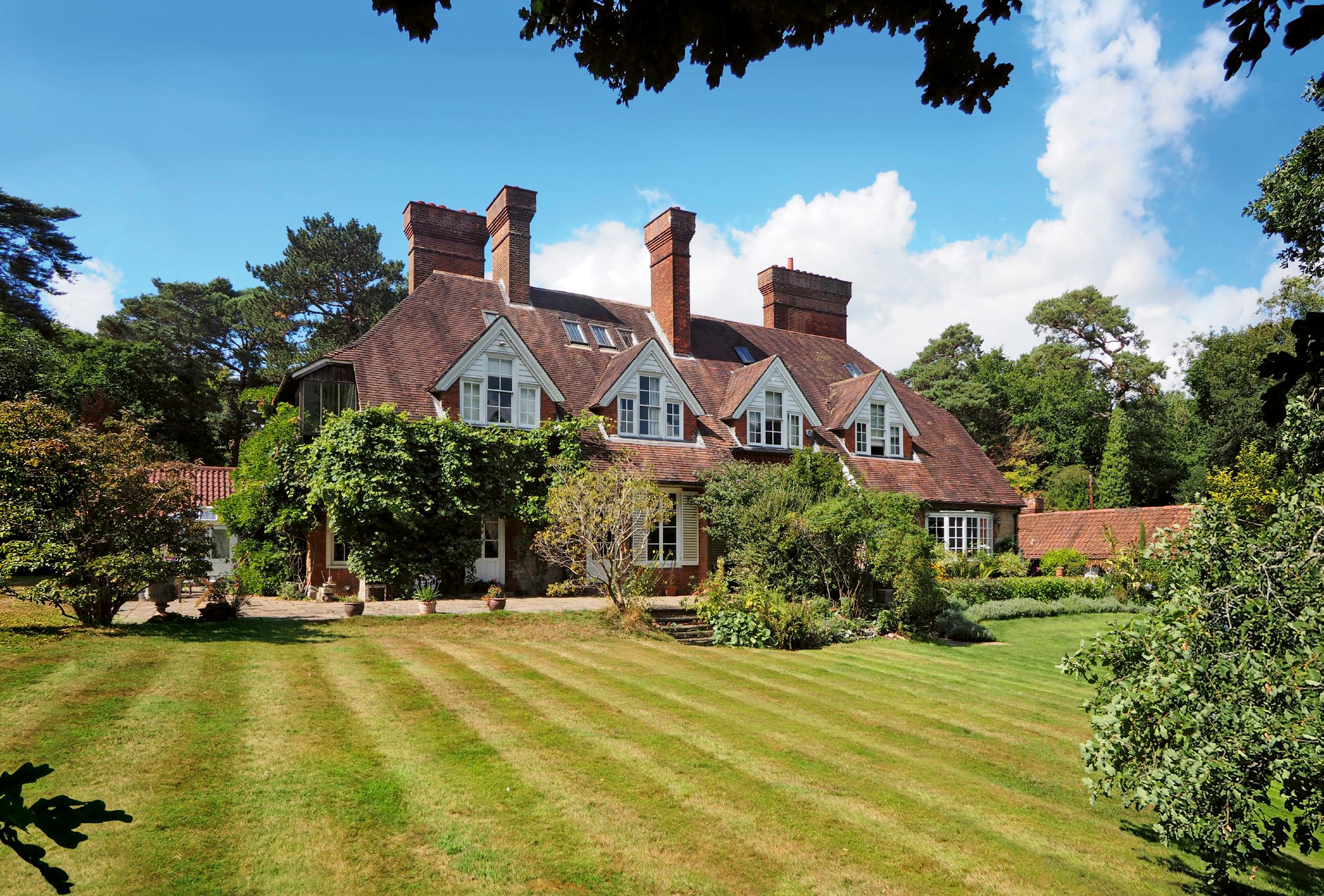
Four Gables was one of an important group of three new buildings Philip Webb designed for the Hon. George Howard (1843–1911) of the Naworth Estate, in the north-east Cumbrian town of Brampton. In 1868, Webb had designed a studio house1 in London for Howard and his wife, Rosalind, and over the following years had done work at his country seat, Naworth Castle, together with Morris and Burne-Jones.2 Subsequently, Howard commissioned Webb to design the three new buildings: in 1874, St Martin’s, a new church in Brampton; in 1876, Four Gables, located a mile to the northeast of the town, as a house for the estate manager;3 and in 1877, the vicar’s house.4 All three buildings were constructed of the same local red sandstone, and all roofed in the same green slate, also quarried nearby.
Webb’s Four Gables was his most, unambiguously, symmetrical building. Avoidance of predetermined symmetry, in either the organisation of a building’s floor plan or the shaping of its forms or elevations, such as in the manner of Classical architecture, was one of the cornerstones of Arts and Crafts philosophy. Nevertheless, very few of the movement’s architects were able to totally resist the attraction of symmetry, most commonly in their incorporation of symmetrically designed configurations within an overall asymmetrical composition. It is ironic, that Webb, founder of the architectural arm of the movement, friend to its prophets Morris and Ruskin, should so consistently through his career have incorporated strongly symmetrical vignettes within his buildings; and that, reflecting his love of the English Baroque, his interior joinery designs were, from soon after Red House, essentially understated derivations of Classical forms.
Webb’s floor plan of Four Gables started with a basic square, projected vertically through two floors,5 and roofed with the eponymous identical four gables: the ridges, set at equal levels, forming a perfect ‘Greek cross’, the arms bisected by the diagonal valleys. The elevations were near identical, distinguished by the respective single-level projections on two of the three exposed faces of the form: an entry portico to the west elevation, and a dining room bay window on the east. Such purity of form belied Webb’s informal, in truth somewhat forced, plan arrangement, apparent once inside the front door, beginning with a splayed wall shepherding one left into the hall and the adjacent main stair, with a study to the right, the
RIGHT Front entrance view, showing the local red sandstone construction of the building, revealing the perfect square plan of the main house form, and Webb’s unconventional advancement of the service wing to the left of the main house
Cheshire, 1864
Stowford and Magnolia Cottages
Eden Nesfield
In his introductory chapter of Das Englische Haus, Muthesius wrote of William Eden Nesfield: ’Change was effected during the 1860s by three architects … Their method was to design more freely, paying attention to utility, material, and other purely practical considerations. At the same time they looked towards the simpler country buildings, in particular houses in villages and small towns, built in the tradition of the old masons’ guilds. The three men were Philip Webb, Eden Nesfield and Norman Shaw.’1 Muthesius had perfectly identified the three pioneers of the revival of the vernacular manner. 2 Beyond this commonality, the distinctions of Shaw’s and Webb’s approaches have already been discussed, particularly in Shaw’s characteristic Old English and Queen Anne manners, in contrast to Webb’s more fundamental design manner. Eden Nesfield was not only more aligned to Shaw in these respects, but was an equal party in Shaw’s development of the Old English and the Queen Anne. Nesfield and Shaw had first met as young men in 1851, while both were in the office of William Burn and studying at the Royal Academy Schools, becoming friends and eventually, for a period, forming an architectural partnership,3 from which would emerge their common design approach.
William Eden Nesfield (1835–88) was born in London, the son of a successful landscape architect and painter, William Andrews Nesfield (1793–1881). He had been educated at Eton, then following his articles with Burn from 1850 to 1852, he worked in the office of Anthony Salvin (1799–1881),4 as previously discussed, an important Victorian architect working with medieval buildings in the Picturesque manner, who was a friend of Burn, and Nesfield’s uncle by marriage. Nesfield travelled extensively through Europe during this period,5 eventually leaving Salvin’s office in 1860 to set up his own practice. 6 Nesfield’s earliest private commissions came mainly through contacts of his father; however, a career turning point came when Shaw left George Edmund Street’s office in 1863 to set up his own practice, and Nesfield and Shaw began travelling together on trips throughout west Kent and Sussex, studying and drawing vernacular buildings. They also studied the works of recent architects, particularly those of William Butterfield and George Devey, including Devey’s cottages at Penshurst Place in Kent, designed over
right Front south elevation, the design expressing the building’s dual occupancy. The highly picturesque composition, particularly the double-cantilever front bay windows, was built in Nesfield’s full range of Queen Anne–style materials
London, 1893
25 Cadogan Gardens
Arthur H. Mackmurdo
The building at 25 Cadogan Gardens in London, designed for the Australian artist Mortimer Menpes (1855–1938)1, is the best architectural work of Arthur H. Mackmurdo (1851–1942). 2 It is an unusual building, almost defying architectural categorisation; it is certainly not immediately apparent as Arts and Crafts, even for the more formal urban version of the manner. Its reputation as one of the most important Arts and Crafts buildings in London has stemmed largely from its unusual, purpose-designed, artistic interiors, all now long since demolished, and from Mackmurdo’s own reputation as one of the true innovators of the movement; nevertheless, the intact exterior of this building reveals it as a highly original design – and in aspects that are not all obvious.
Mackmurdo’s important role in the development of the Arts and Crafts Movement, especially through his Century Guild, has already been discussed (see pp. 23–8). Born in London, Oxford educated, friend of Ruskin and Morris, Mackmurdo not only embraced and disseminated the design philosophies of Morris, but also committed himself to Morris’s socialist convictions.3 Also like Morris, he applied himself to the widest range of design disciplines: a designer of textiles, furniture, graphics, printing and publishing, exhibitions and architecture. The swirling, organic forms of his furniture and graphic designs – notably those in his famous early 1880s dining chair and the front cover design of his 1883 book Wren’s City Churches4 – were seminally influential in the European Art Nouveau a decade later in the buildings of Hector Guimard and Victor Horta; the tall slender capped finials of his Century Guild stand at the 1886 Liverpool Exhibition were appropriated in the stair designs of both C.F.A. Voysey 5 and Charles Rennie Mackintosh; and the highly eclectic flat-roofed house at 8 Private Road, Enfield, 1887, has been claimed as an early work of Modernism. Despite all this innovation, it is fair to say that the quality of Mackmurdo’s architecture did not reach the heights promised by such a talent. In opposition to Ruskin’s Gothic mantra, from an early age, Mackmurdo was enamoured with the Classical orders, and one can see these elements, infusing his designs, as giving rise to a certain lack of cohesiveness and consistency in much of his built work.
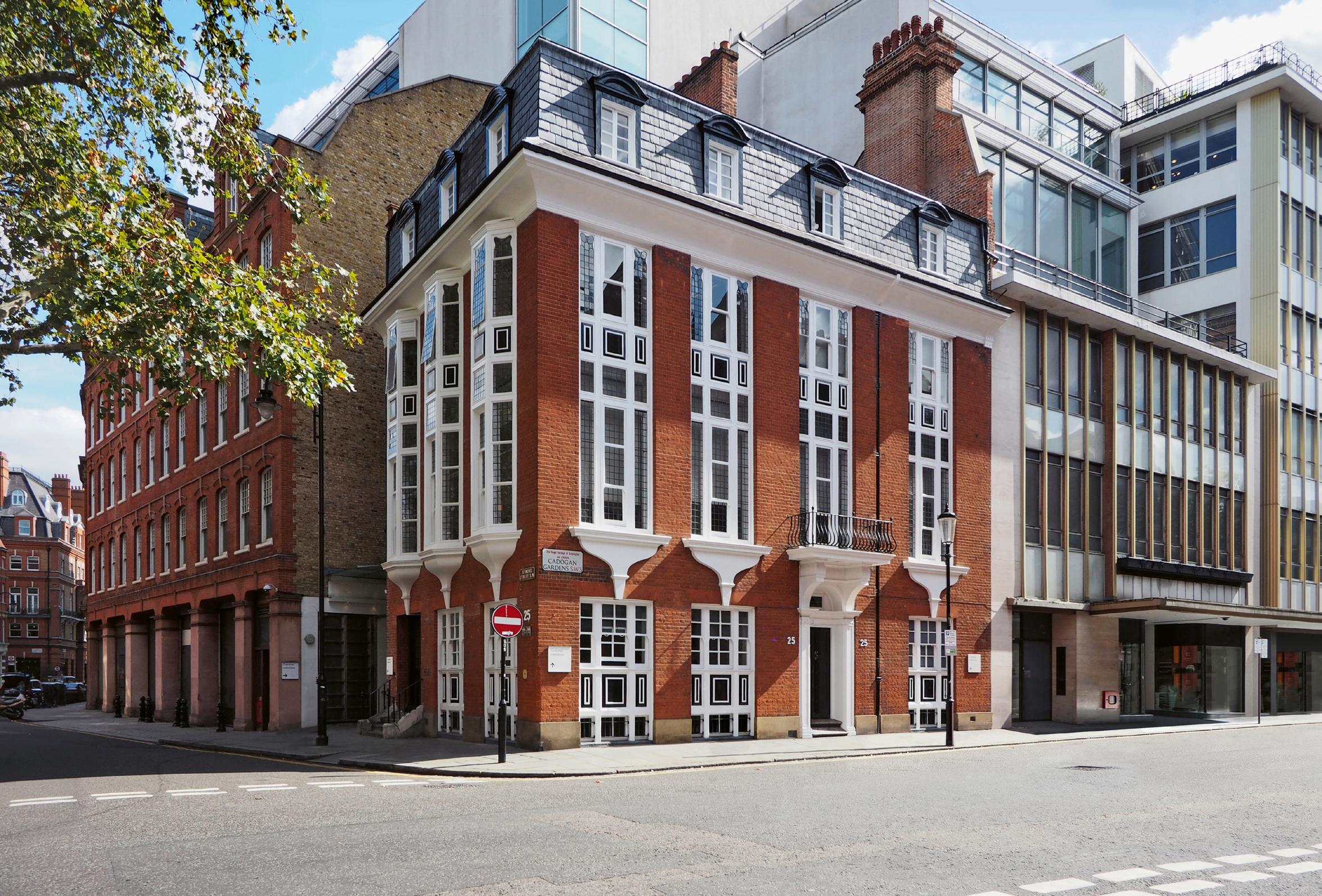
left East view, with the porticoed front door seen right of centre of the main Cadogan Gardens facade, showing the distinctive vertical hierarchy of the elevations, and Mackmurdo’s contrasting treatments of the two-storey high windows to each of the two street elevations
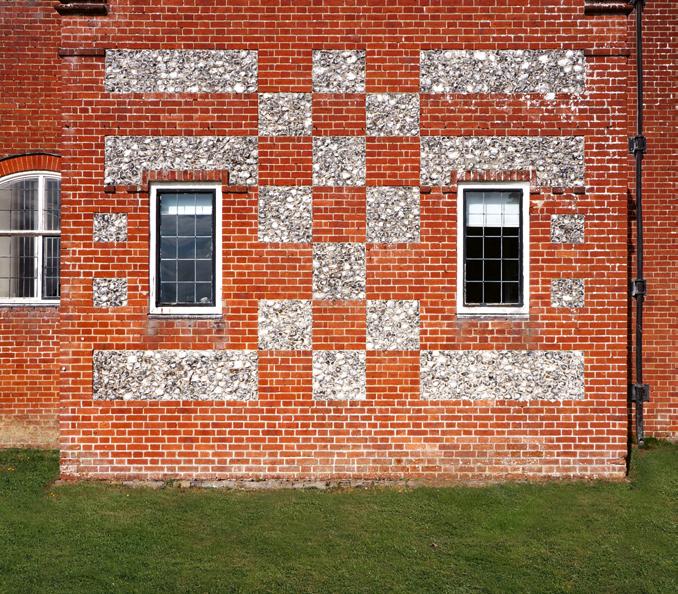
outline is characterised by its eccentric projecting forms: on the north side, two rectangular forms containing service spaces to the left, and the entrance hall and ‘ante hall’ to the right,8 the north-west corner anchored by a deep canted bay window containing the library. The south elevation has projecting bookend forms: at the east end, a massive chimney block, largely blank but for two ground-level windows framing a curious subtly irregular checker grid in brick and flint; and at the west end, a two-storey double canted bay window capped with a recessed third-level gable. Between these end forms is an underlying flush brickwork facade with stone-framed windows, a crowning saw-toothed line of four smaller gables capping a sequence of second-storey windows, with three projecting flat-roofed, canted, two-storey bay windows, each with first-level segmental transoms, set between the four gables below the valleys. The house is essentially of all-brick construction; however, the four connected second-level gables, and the three two-storey canted bay windows set between, today tile-hung, were originally white rendered. This particular ‘composition within the composition’ is Avon Tyrrell’s most fascinating illusion – on first viewing, the four gables appear to be equal in size and spacing, and the canted bays set symmetrically between, yet Lethaby composed these elements, quite deliberately, to be ever-so-slightly unequally sized and asymmetrically arranged (Lethaby’s elevation pictured p. 25).9
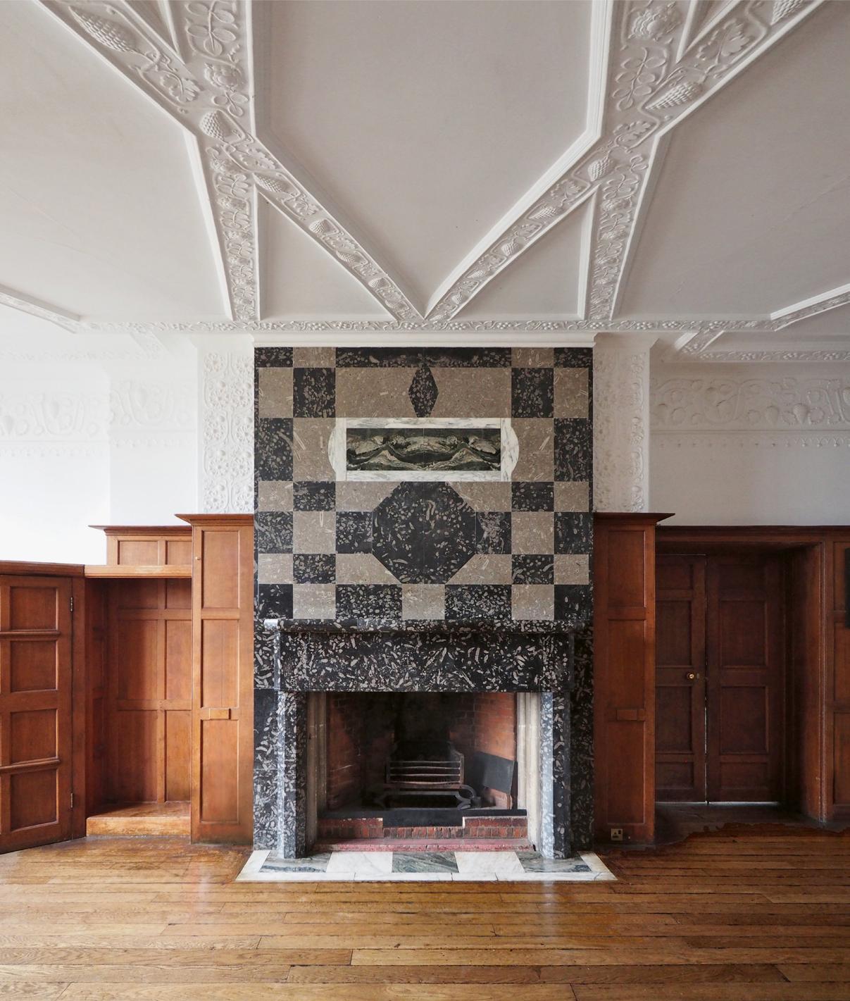
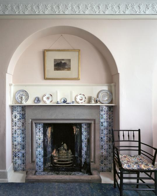
Avon Tyrrell’s interiors were superbly crafted, and simply yet intricately designed – in particular, the timberwork, the various marble fireplaces and the plasterwork.10 Local flora was depicted widely throughout the house, from delicate timber inlays, carvings and fretwork, particularly in the main stair, to the decorative plaster ceilings, the latter all designed by Ernest Gimson in collaboration with Lethaby. The fireplaces throughout the house incorporate a variety of brightly coloured marble facings, most notably that in the west wall of the hall (pictured opposite), which incorporates a dramatic irregular grid of two tones of grey marble, framed by fine oak wall panelling.11
OPPOSITE Fireplace in the west wall of the hall, incorporating a dramatic irregular grid of two tones of heavily figured grey marble, framed by fine oak wall panelling, the intricate ceiling plasterwork designed by Ernest Gimson
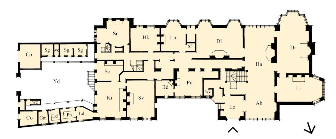
THIS PAGE (TOP) Ground-level floor plan diagram, illustrating the vast elongated plan form, and Lethaby’s well-ordered and efficient space planning; (BOTTOM) Brick and flint checker pattern in the base of the chimney mass at the east end of the south elevation, a complex grid of deliberate asymmetries
the library, contained within existing walls, with a half-flight of stairs leading up to the hall. The hall opened, in turn, to a drawing room in a new L-shaped wing in the south-east corner of the floor plate, and left to the dining room, a corridor further left leading to the service block, the floor level elevated, giving natural light to the basement level kitchen, storage and servants’ spaces. The stair was incorporated into the front corner of the hall, leading up to seven main bedrooms on the first level; the service stair connected to five servants’ bedrooms on the second floor, over the north wing. As if by way of giving contrast and haven against the exposed location of the place, Lethaby’s interiors were light and delicate throughout: with white-painted timber panelling and mouldings, in the manner of Webb’s houses built after Red House; decorative plasterwork ceilings and friezes; and the whole house furnished with Morris tapestries and furniture pieces variously designed by Morris, Gimson and Lethaby himself. The hall incorporated an unusual triple-moulded stone fireplace, with five corbelled stone candle-holders in the face of the chimney.
The exterior architecture was faithfully designed to local vernacular traditions, the new building work constructed in the same roughcast sandstone rubble and local red sandstone, and thick Caithness stone roof
slates, of the existing house. Notwithstanding this consistency, there was a ‘Ruskinian changefulness’ to much of Lethaby’s elevation detailing: the new east wing contained the drawing room, and one of the larger bedrooms over incorporated a crow-stepped gable detail similar to those found throughout the Orkney islands; whereas the other gabled forms were detailed with more conventional stone coping parapets, with varying kneeler treatments.
Lethaby built a number of other structures on the island, both concurrently and after the main house, including two shooting lodges, a new farmstead, the agent’s house, cottages, two stone bridges, and the robust but exquisitely designed Chapel of St Margaret and St Colm building, designed in 1900, situated close to the house to the south-west corner of the entry courtyard. The simple rectangular, gabled chapel building – foreshadowing Lethaby’s final building, the All Saints Church, Brockhampton, Herefordshire, 1902 – was constructed with a mass concrete roof, supported on massive stone vaults and buttressed dressed rubble walls, and the roof clad in Caithness stone slates; it contained exceptional stained-glass windows designed by Ford Maddox Brown, Edward Burne-Jones and Christopher Whall.
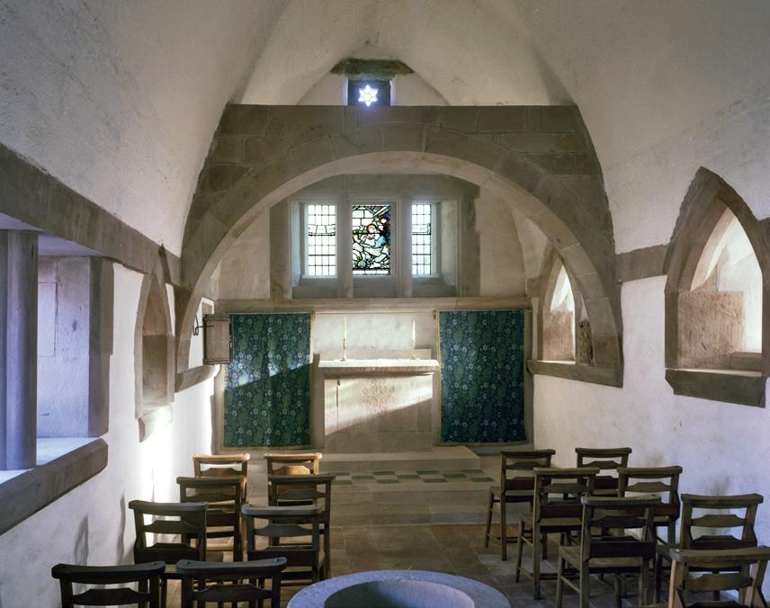
Opposite (left) Altar view in the chapel building, dedicated to Saints Colm and Margaret. The roof was constructed in mass concrete supported by the buttressed walls and interior stone arches; the stained-glass window was by Ford Maddox Brown; (RIGHT) Decorative plaster frieze over a stone fireplace set within arched recess
THIS PAGE (LEFT) Ground-level floor plan diagram, an ingenious composition of retained and new walls, as two interlocking L-shapes, the retained walls forming the library and the chintz room at the south-west corner. Inside the front door, existing walls formed the library, with a half-flight of stairs leading up to the hall; (RIGHT) Courtyard doorway and clock, the roll moulding architraves salvaged from the demolished portions of the steadings and refitted around the doorway
Leicestershire, 1892
Inglewood
Ernest Gimson
The importance of Ernest William Gimson (1864–1919)1 as a key figure of the Arts and Crafts Movement has already been discussed (see p. 30). Born in Leicester, 2 he entered the office of J.D. Sedding in 1886,3 where he met Ernest Barnsley (1863–1926) and, later, Ernest’s brother Sidney (1865–1926), with whom he shared a lifelong friendship. During this period, Gimson developed his passion for furniture design,4 and in 1890, together with the Barnsleys and others, he set up a short-lived furniture workshop, Kenton & Co, in London.5 In 1893, Gimson and Sidney Barnsley moved to the village of Ewen in the Cotswolds to set up their new furniture workshop nearby, Ernest Barnsley joining them the following year, before finally moving to Sapperton in 1902, where Gimson would remain with his family for the rest of his life.
Inglewood was Gimson’s first major architectural commission, designed for himself in his home town, 6 although he would never live there,7 and built in a leafy suburb to the south-east of the town centre, on a large southwest corner block. Gimson’s floor plan was an irregular rectangular form aligned on an east/west axis, the front door set in a split three-level shallow projecting form, containing a north-facing recessed porch at ground-level, and the main stair. The porch opened into a hall, in turn, opening into the south-facing dining room ahead, and left to a large corner drawing room, with views front and back, and a large semi-circular bow window facing south to the main back garden. The kitchen and service spaces were located to the opposite west end of the plan, with adjacent annexed storage spaces and a coach-house framing a stable yard. 8 Gimson’s interiors were simple and well-crafted, with white panelled walls, decorative floral plaster designs to the ceiling beams and friezes, made by Gimson himself, and a variety of stone-faced fireplaces, the drawing room fireplace with bold jigsaw-jointed grey marble facing, and a fine cyma-moulded black marble mantle-shelf.
Gimson’s exterior architecture was both understatedly complementary to its surroundings, yet also strikingly modern. The walls were constructed in English-bond red brickwork, with shallow-arched, white-painted sash windows. The all-gabled roof was a highly original angular composition, particularly the front aspect, which juxtaposed the tall, narrow threelevel stair form against a long catslide roof descending to the ground-level window line, forming a low eaves canopy to the front door; the end parapets
RIGHT Front and west elevations showing Gimson’s highly distinctive roofscape design, the dormer, brickwork, and fenestration designs recalling Webb’s work
Surrey, 1899
Tigbourne Court
Edwin Lutyens
Tigbourne Court was built for William Edgar Horne1, near Witley, its front elevation facing west, and its main gardens wrapping around the house to the south and east. Tigbourne Court was the first building where Lutyens would employ Classical elements – both in plan and elevation – in such an overt manner, although he chose to confine them almost solely to the west side of the building. Tigbourne Court’s west roadside elevation (pictured right) is an architectural tour de force – an endlessly rewarding design narrative. Created by an architect just thirty years of age, this was architectural art of the highest order on display. 2
In the ground-level floor plan, the west front entry elevation formed a near perfectly symmetrical U-shape perimeter, with single-level wings accommodating the kitchen wing on the left, and a drawing room in the right-hand south-west wing. An entry vestibule was set centrally between the wings, itself designed as a U-shape, a miniature of the overall, and incorporated into a colonnaded recessed entry loggia. Within this parti, Lutyens created a brilliant array of concave circular geometries. The entry forecourt was scribed with a semi-circle defining an arrival forecourt, with a concave paved apron within the U of the plan defining the front entrance. The inside and outside corners at the ends of each of the wings were notched in plan by a concave quarter-circle, each pierced with a single small window; another opposing concave quarter-circle element was set beside each of the outside quarter-circle notches, forming the left-hand and right-hand extremities of the whole composition, positioned away so as not to form concave semi-circles, but instead ‘half-lozenge’ geometries. In these elements, Lutyens created a piece of high architectural illusion, with the full width of the left-hand centred concave forming a part of the service wing, whereas the true nature of the matching right-hand concave was disguised by a single quarter-circle concave in the right-hand corner of the narrower drawing room, and the opposing concave being a freestanding quarter-circle garden wall, the half-lozenge shape maintained by means of an interposing garden gate, which matched the door into the service wing on the opposite side.3 Lutyens gave us a clue as to the illusion, with a pair of windows to the kitchen and coal store in the external niche in the left-hand service wing, but a single inglenook window opening only to the right-hand space – evidently he was resisting the temptation of incorporating a window into the garden wall.4
Front west elevation, Lutyens’s most iconic single building elevation: counterposing irregular concave geometries, rich materiality, carefully proportioned forms, Classical elementation and complex architectural illusions
RIGHT
Little Thakeham
Edwin Lutyens
Little Thakeham was built a few miles north of Storrington, on the northern edge of the South Downs. Lutyens’s client was Ernest Murray Blackburn, a keen gardener, who built Little Thakeham as his retirement home.1 Little Thakeham marked a zenith for Lutyens in bringing together the Classical and vernacular architectural styles: not, in this case, only a combining of styles but, also the creation of a Mannerist-Baroque rendering of a prime living space – staged within a traditional manor house–style exterior. 2
Approach was via a long drive that led past the house to the stables. A north entrance forecourt was marked by a low stone wall and two gate posts facing the drive, axially aligned to the front door via a flagged stone path leading to a central, tall, gabled entry porch form (pictured right).3 The whole effect created the impression of the private drive being a picturesque English country lane passing by the house. Lutyens designed an H-shaped plan form, which, together with its configuration of forms, was derived essentially from a late-16th-century Elizabethan manor house model.4 The house was built, inside and outside, of Hythe sandstone, quarried from the site.
At ground-level, the central front entrance opened onto a wide transverse east/west corridor, a door at the right end into the library, and at the opposite end into the service wing.5 A single door in the corridor wall, right of centre, led through to the main living spaces – and to one of Lutyens’s most serendipitous and ingeniously designed journeys. The door led into a short passage, a single window in the south wall straight ahead, and to the left a stone screen with two Classical segmental pedimented openings to the double-height hall space, each opening framed with heavily rusticated ‘Gibbs surround’ architraves. To the right of the window a door led out to the garden, with a further short passage to the right to the drawing room forming the south-west wing; the dining room on the opposite side of the hall formed the south-east wing. The main stair, located off the small corridor between the hall and the drawing room, was a broad sequence of steps incorporating an intermediate landing, which formed a minstrels’ gallery overlooking the hall, the gallery dividing off in two directions –north through a door to the first-level corridor, and continuing west up six steps to the first-floor main bedrooms suite of the west wing. Centred
RIGHT North entrance aspect, an axial, hierarchical progression of elements. Lutyens’s symmetrical Tudor-style form, with tall paired chimneys at the gable-ends and stone vernacular exterior, concealed a dramatic Classical interior.