
ORO Editions
ORO Editions
Revisiting “On Adding On”
The historian Anthony Alofsin once said of the prolific author Frank Lloyd Wright that writing was for him, “… a vehicle to sort out and through his ideas…Books and articles could circulate buildings rested in place.” For many architects, analysis and synthesis are reciprocal processes in making architecture. Writing not only clarifies ideas but can codify them. “On Adding On,” published in a 1985 edition of Thresholds, the Journal of the school of architecture at the University of Illinois Chicago, served that purpose. An important influence at the time was Michael Graves’ 1975 article in the Journal of Architectural Education, called the “Swedish Connection.” In it, he describes a studio problem he taught at Princeton University which asked students to add on to the 1918 Snellman House built by the Swedish architect Gunnar Asplund. In his article, Graves suggests that a strategy for making additions is to think of the original building as an incomplete “fragment” and to image an addition as a completion of that “fragment.” This suggests an extrapolation of both the plan organization, the compositional ideas of the building’s massing and openings, and even the idea of the addition as a recall or a play on the original building’s architectural language. Graves recalled that many of his students designed additions to the front of the house that tried to resolve the


compositional duality of the entry doors and the French doors out from the living room to the same raised entry terrace. This suggests that additions might also be thought of as “corrections,” which was the interpretation of the south half of Chicago’s Monadnock building suggested in “On Adding On.”
Editions
Snellman House. Gunnar Asplund, architect. Djursholm, Stockholm, Sweden. 1918.
While Graves would later come to national prominence for his postmodern buildings and his product designs, the implication of his article seemed to be disconnected from his work of the same period. The “Swedish Connection” was a mindset to establish a starting point for a design rather than an actual strategy. Most additions are either pavilions or extensions of an existing building. Even vertical and concentric additions are forms of extension. This was the thesis of “On Adding On” which illustrated these categories with both historic and contemporary examples. The second impetus for this article was the idea of contextualism, formulated as an urban design strategy at Cornell University in the 1960s and ‘70s in the Master of Architecture program in Urban Design, taught by Colin Rowe. This strategy did not address the design of new cities but adding to or infilling areas of existing ones. The characteristics—street grid, geometry, and building types—of the existing urban context were taken as a starting point in design. As a strategy, contextualism seemed equally applicable to architectural design. This was suggested in Cohen’s 1974 article, “Physical Context, Cultural Context, Including It All” in the second issue of Oppositions, the journal of the Institute for Architecture and Urban Studies in New York, which existed from 1967 to 1984. We believed that these ideas also applied to the design of building additions. The existing building is the context. Choosing the context as a starting point requires a conscious value judgement. This judgement is the acceptance or rejection of the existing conditions. An alternative to blindly accepting the context and simply replicating it was the idea that an addition could be a commentary or criticism of the original building or an attempt at its transformation, an idea also explored briefly in “On Adding On.”
also included the addition of two second floor bedrooms, a shared bathroom, plus the creation of a two-story stair hall. Rather than simply adding a shed dormer to create headroom for the new bedrooms, the roof was raised creating a double gable end for the main house. This transformation involved imagining that the house was part of a tradition of double gabled American and English houses.


ORO Editions
Home office addition Top: Before. Plans and front elevation. Bottom: After addition. Plans and front elevation.
Principal Bedroom Suite and Sitting Room Addition. Frontal Extensions.
Adding to the back of a 1950s ranch style house raised the question of how it might be transformed into a version of its archetype, Frank Lloyd Wright’s Usonian houses. While the work done was primarily a one-story extension across the entire rear of the house, adding a new primary bedroom suite at one side of the house, a story and a half high extension of the living and dining area, and a den-library on the other side, the scope of the work also allowed us to reside the entire house. Alternating wide and narrow width lapped bevel siding visually helped reinforce the house’s horizontality and tie the existing and new parts of the house together. The new alternating width siding intentionally recalls Wright’s early work, such as his 1898 River Forest Golf Club or his 1905 Glasner House.


Top: Before addition. Bottom: After addition at the back of the house.
ORO Editions

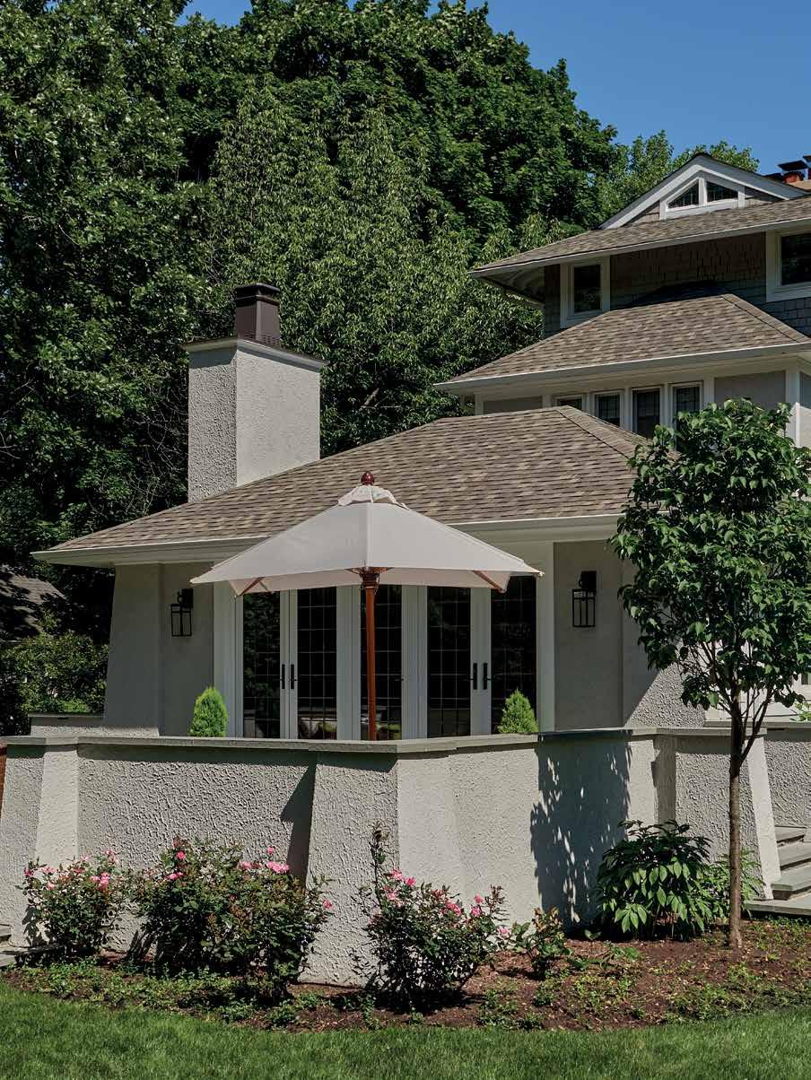
New family room addition and new raised terrace. New side entrance and mudroom addition on the right.
ORO Editions
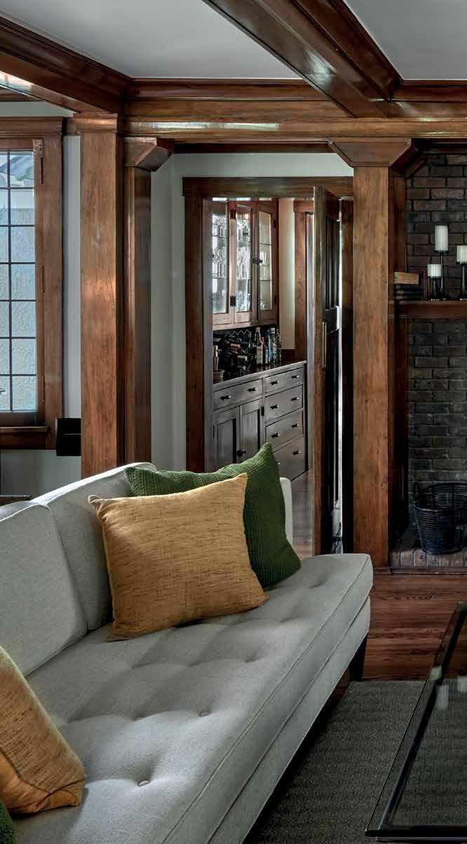
The existing great room with main stair to right of the fireplace and existing butler’s pantry to the left.
ORO Editions

ORO Editions

ORO Editions
ORO


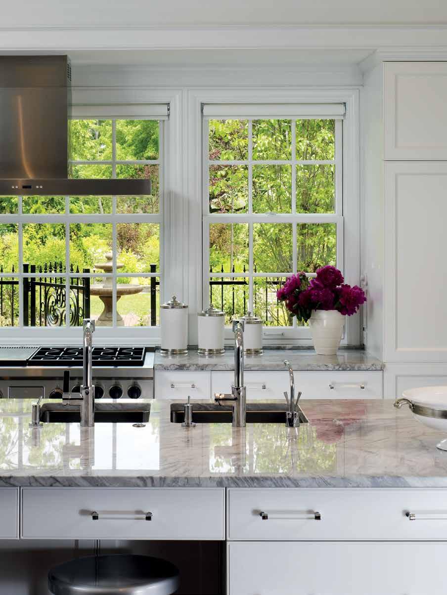
Left: The new kitchen, including a hidden spice rack (above) on either side of the range.
ORO Editions
Backwards House ORO Editions
View to new side yard garden where neighboring house was located.
ORO Editions

ORO Editions

ORO Editions

ORO Editions
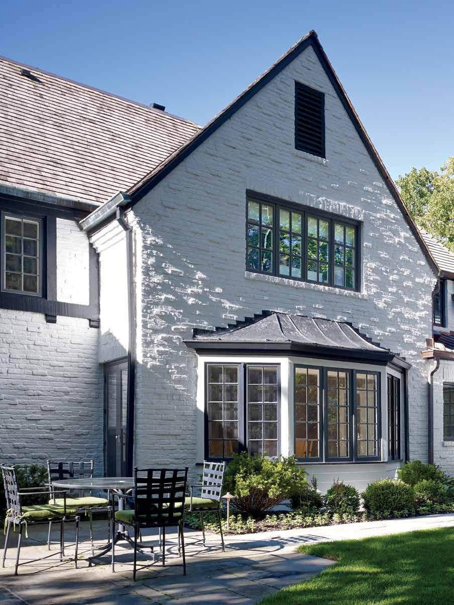
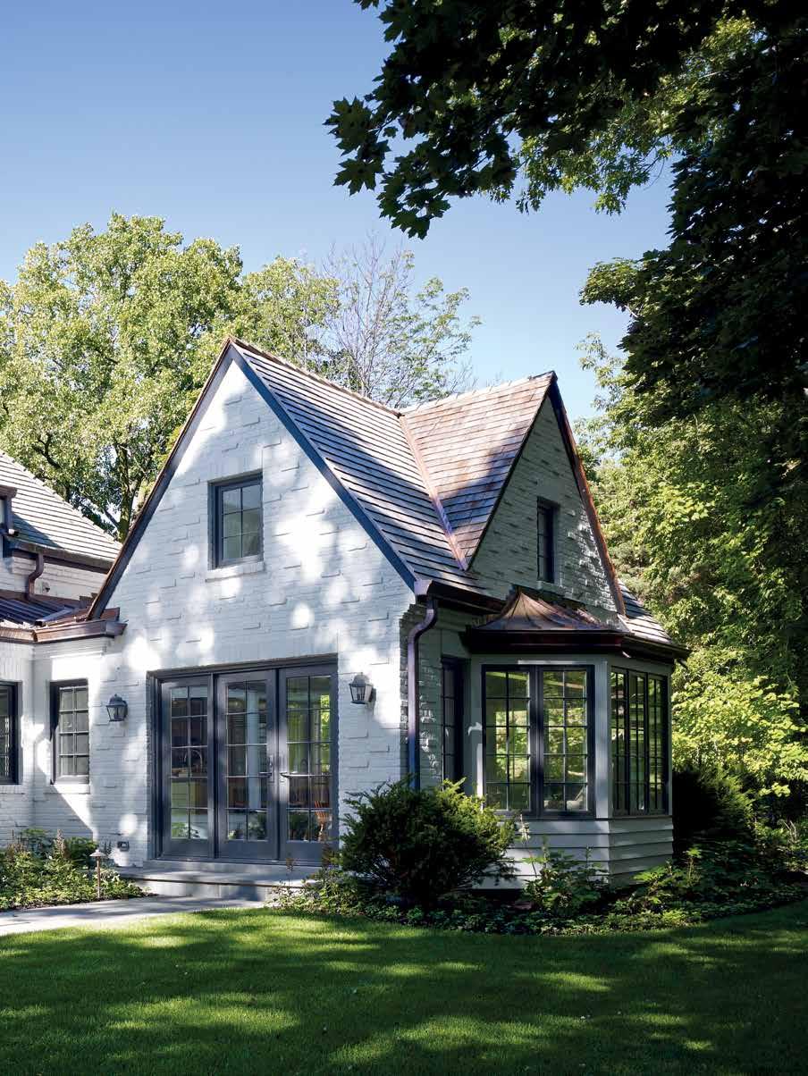
Built in the 1920s, this painted brick Englishstyle country house was designed by Ernest Grunsfeld Jr., the architect of Chicago’s Shedd Aquarium. Grunsfeld graduated from MIT, America’s first school of architecture in 1919, and then attended the Ecole des Beaux Arts in Paris and the American Academy in Rome. Sited at the edge of a wooded ravine, the main body of the house opens to a south facing lawn. Extending north from the corner of the house, along the edge of the ravine, was a two-story wood sided service wing with a kitchen and butler’s pantry on the first floor and a back stair accessing bedrooms above.
An old photo of this portion of the house shows a free standing, two-car garage with a tall, hipped roof immediately to the north, probably built in the 1950s. At this time, the kitchen was remodeled with a breakfast area overlooking the ravine. The kitchen was typical for its day with flush overlay doors of white plastic laminate, white plastic laminate countertops, and four inch by four inch white ceramic tile backsplashes. In the 1990s, a two-car brick garage, side entrance, and mudroom were added where the wood garage stood. The garage addition was a handsome, compatible design done in painted brick by Chicago architect Kathryn Quinn. Our first instinct was to try and save it. Because of the amount of space required for a new kitchen, breakfast room, family room, and mudroom, and the new zoning setbacks required from the edge of the ravine, the garage needed to move forward to the west on the site. A version of Quinn’s garage design was reconstructed, and the service wing was extended with a higher roof ridge to match the main body of the house. This infill addition was given a new crossgable and recessed entry to mark the house’s reconfigured service entrance.
Inside the house, all the ground floor woodwork still had its original finish, and the cabinetry in the living room and the library were the starting point for integrating
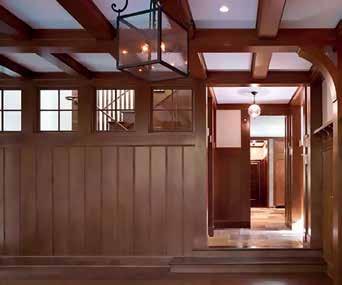
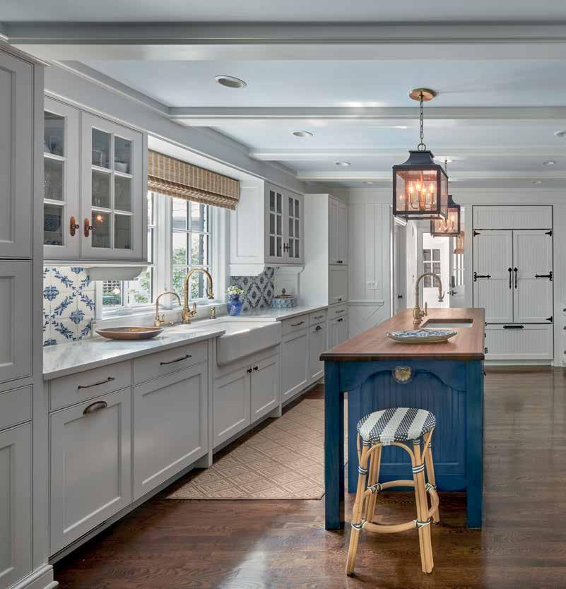
the new trim and cabinetry in the addition which contained the new kitchen, butler’s pantry, breakfast room, family room, and new back stair. A unique feature of the cabinetry in the original house was raised diamond panels. These were matched for the upper row of kitchen cabinets which carry up to the ceiling. The kitchen cabinets were visually supported on wrought iron decorative brackets with scrolled ends.
The new back stairs arrive at a landing with very tall windows overlooking the ravine. The transom windows over the casements used in the family room continue across the wall at the side of the new back stairs. On the second floor, the stairs arrive at a new sitting area for two new children’s bedrooms. Above the kitchen, space was added to the main bedroom at the corner of the existing house. This was used for walk-in-closets, a dressing area, and a new principal bathroom with a vaulted ceiling overlooking the ravine. By pulling the garage forward, it now forms one side of an entry courtyard.
ORO Editions
New family room addition looking toward kitchen.
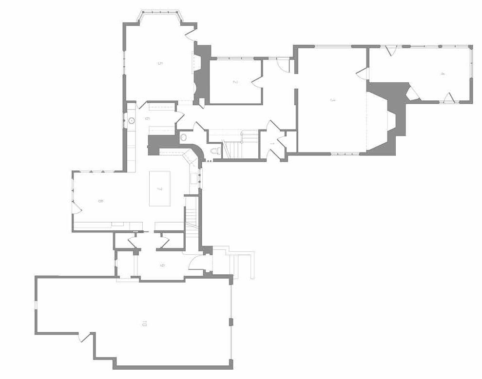
1. ENTRY
STUDY 3. LIVING ROOM
PORCH
DINING ROOM
BUTLER’S PANTRY
KITCHEN 8. BREAKFAST ROOM
BACK ENTRY
GARAGE 1. ENTRY
STUDY
LIVING ROOM
PORCH
DINING ROOM
BUTLER’S PANTRY
WALK IN PANTRY
KITCHEN 9. BREAKFAST ROOM
BACK ENTRY
FAMILY ROOM
MUDROOM
GARAGE


ORO Editions
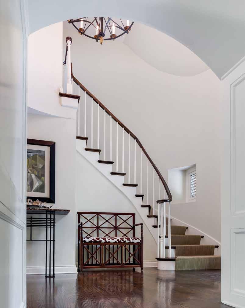
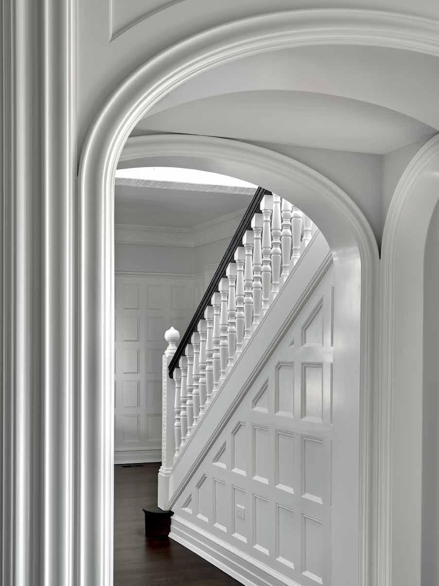
Left: Entry hall after remodeling. Right: Remodeled stair with new balusters and railing, as seen from entry to living room.

ORO Editions

Entry and stair hall looking into remodeled family room.
ORO Editions
ORO
Above: New kitchen seen from breakfast room. Right: Detail of hood and French made range.

ORO Editions
While not a project that involved an addition, this remodeling represents a way of thinking about altering the exterior and interior of an existing house whose forms and details had been compromised by earlier work.
Awkwardly renovated in the 1980s, with a family room added to the back of the house, the exterior was given ill-proportioned postmodern elements. We replanned the interior of the house to interconnect the house’s main space. The details and interior trim were reinvented versions of what was left in a few of the unremodeled parts of the house. The front porch and entry were redesigned, and a column made to match the existing front columns was added to try and regularize the porch’s bay spacing. The front porch balusters were also replaced with simple square ones at a closer spacing.
The existing addition was retained but its exterior along with the back of the house was redesigned to incorporate elements that recall those of the existing house including a new “Palladian Window” on the third floor like the one at the front of the house. The family room addition had two steps down from the adjacent kitchen. These went almost the full width of the family room and the new owner felt they were a tripping hazard. The floor was raised to the kitchen level and the existing flat ceiling was removed to extend the space upward to the bottom of the existing collar ties of the original roof framing. In the entry hall, the bench and wall paneling turned out to be a later addition to the house, but one that was poorly integrated into the adjacent stair. This was “tweaked” to make the new bottom stair treads better integrate into the surface of the bench. The stair stringer and stair treads had been painted and to further tie all these elements together the paneling behind the bench and the bench’s front were painted. Because the kitchen was located behind the family room addition, its only exterior wall faced a house a few feet away. With

the sink moved to the island, there was no need for a tall window along this side of the kitchen. To bring in light from the side, we introduced horizontal awning windows. These are not visible from either the street or the backyard. Under the glass fronted upper cabinets we introduced horizontal awning windows that are not visible from either the street or the back yard.
ORO Editions
House with 1980s addition before remodeling.
1. FRONT PORCH
FAMILY ROOM
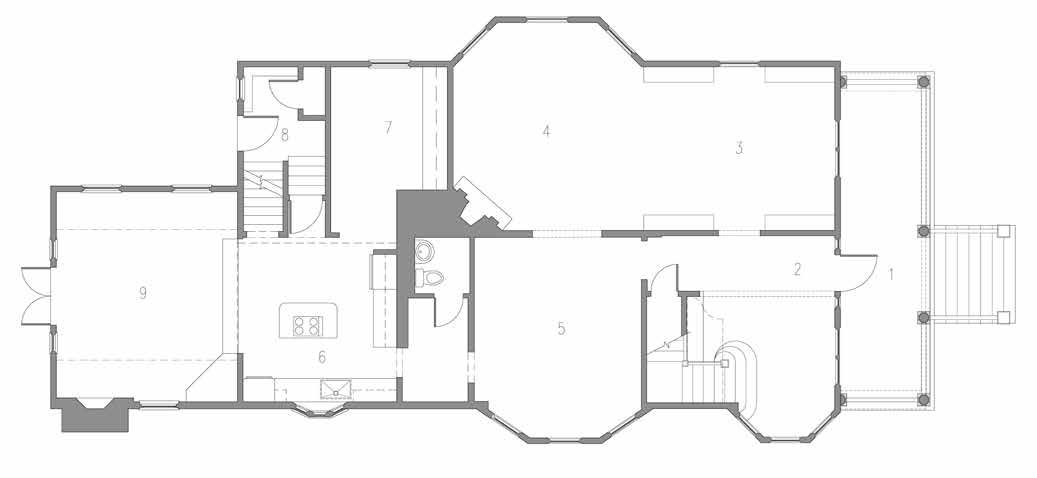
1. FRONT PORCH


