chaPtEr II : aPPlIcatIons of art PrIncIPlEs In VIsualIzatIon
• framE
• PlacEmEnt
• scalE
• dynamIc and EnErgy
• nEgatIVE and PosItIVE
Design Visualization: Exploring ExprEssivE visualization through art FundamEntals
• color
• harmony
• contrast
• focal PoInt
• comPosItIonal gEsturEs
• sPatIal structurE
• grouPIng and dIrEctIon
• IllusIon of dEPth
• VIsual wEIght and moVEmEnt
chaPtEr III : PrIncIPlEs and ProcEss of VIsualIzatIon
• tEchnIquEs of VIsualIzatIon
• tEchnIquE I: dIgItal-dIgItal, steps And process of VisuAlizAtion, (Project: texas a&M University, tx, Usa)
• tEchnIquE II: mIxEd mEdIa, steps And process of VisuAlizAtion, (Project : the Plaza of harvard University, Ma, Usa–constrUcted and ward-winning Project)
• tEchnIquE III: frEEhand-dIgItal, steps And process of VisuAlizAtion (Project : westMoor Park, ct, Usa–first Place national design coMPetition)
conclusIon
samPlE IllustratIons
CHAPTER I:
art ElEmEnts and ExPrEssIVE drawIngs
This chapter describes how design concepts can be presented in a simple and abstract way as to provide the most expressive and comprehensible impression. Since this section focusses on the works of masters of art and the analysis and comparison of principles and concepts used in their works, discussions of this section are generally accompanied by freehand drawings. However, this does not mean that the principles introduced in this section only apply to freehand drawings. As a number of topics in this section often refer to the subjective fundamentals, it is worth noting that these topics are also applicable to other techniques such as digital and mixed media. Given that this study addresses designers, the discussions of the drawing will only be deep enough to fulfill the needs of design studios, and will not include the encompassing and complete drawing didactics employed in art programs. Three fundamental art elements will be explores in this chapter:
• Line
• Tone
• Form Works of masters of art will be illustratively referred to in order to complement and support the chapter’s discussion. After analyzing uses and implementations of these elements in the masters’ works, their application to the presentation of design concepts will be studied, and their possible meanings and interpretations will be discussed comparatively.
abstract drawIngs (type ii)
• Abstract drawings type II: Precise and simple drawings which offer a real and comprehensive introduction of the object or the space: These are drawings which, although they appear sketchy and quick, are actually made with great precision and with respect to the dimensions, proportions, structural relations and the principles of perspective, so that they can present the real and physical properties of object/space in a comprehensive way. They can be very simple and include only a few lines which present the structure, or they can be very complex and include many details. In whatever stage, these sketches can provide a reliable introduction of the entity of the object or the space.
In these types of drawings, despite drawings type I, which were introduced in the previous section, the emphasis is mainly on the physical structure of the object or the space and not on its mood and concept. Figure 1-6 and 1-7 exemplify the character and thinking process of these drawings. Given that these drawings are based on the perspective principles, despite the previously discussed drawings, they can be developed and lots of further details can be added to them. Therefore, it is recommended to use this type of drawing in the stage of developing and finalizing the design. These drawings can also be easily combined with other techniques and media (Figure 1-8). In chapter three, example three, freehand-digital technique, it will be explained how these simple drawings can be further developed and even mixed with digital elements in order to present a real, rendered image of the designed space.
fIg 1-7. Abstract drawing of an interior space. Pencil on paper, 8 1/2 x 11 in Illustrated by Shima Rabiee
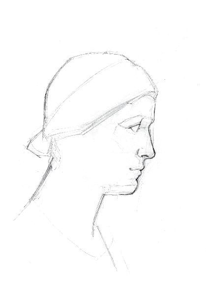
fIg 1-6. Female, profile. Pencil on paper, 11 x 17 in Illustrated by Shima Rabiee
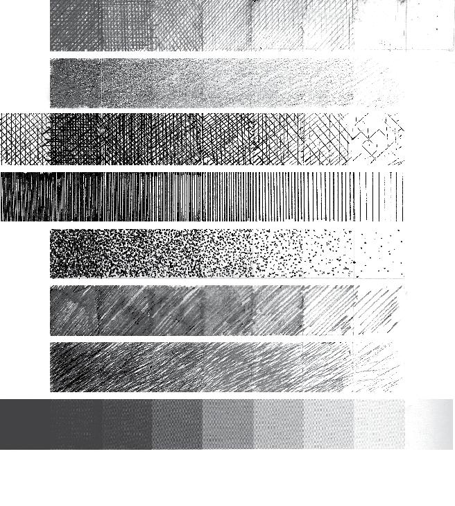
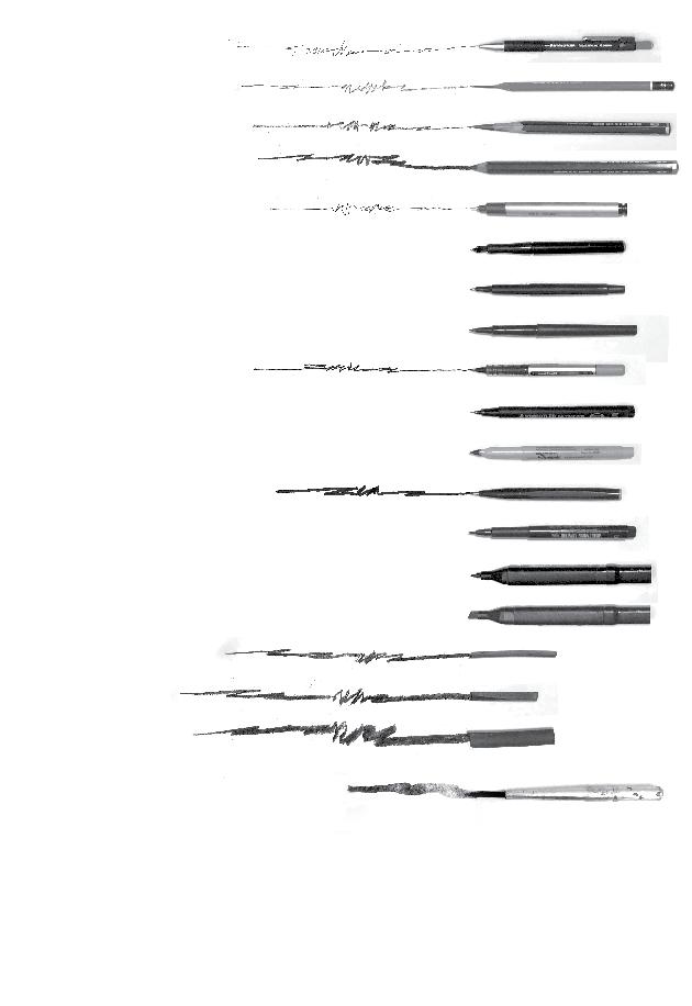
Each tool possesses the ability to create different tones. As we mentioned in this discussion, tools such as pencil or charcoal can create different tones by applying various pressure on the paper, or changing the thickness or angle of the tip. Other sharp-pointed tools with a constant line weight which can only draw homogeneous lines, can also create tone by drawing textures and hatches. Different hatching methods and densities can create different tones. The following examples on Figure 1-50 show a number of methods for creating different tones using various tools.
fIg 1-50. Methods of creating tone with various tools
Pen, pencil, marker and charcoal, 11 in x 17 in
Illustrated by Shima Rabiee
Highlight
Light
Shadow
Core of shadow
Reflected light
Cast shadow
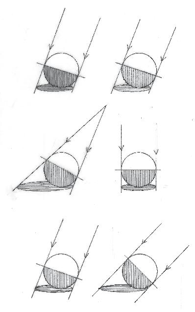
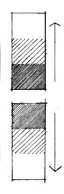
The extent and intensity of shade and shadow created by light is determined by the following factors (Figure 1-72):
• Intensity of light : Wherever there is light, there is also shadow, and hence there are different tones. In the same way, wherever the intensity of light is higher, the shadow is darker and hence the contrast between darkness and light is greater (Drawing A).
• Distance to the light source: Sunlight, which is considered a light source at infinite distance and therefore with parallel light rays, creates smaller shadows than spotlights. The closer the light source gets to the object, the bigger and more deformed does its shadow become and vice versa (Drawing B).
• Direction of light: The more vertically light rays shine on the object, the shorter the shadow gets. Noon light, when the rays of the sun shine nearly vertically, or sunset light, when the angle of rays is too sharp, are not recommended for sketching or photography (Drawing C).
Drawing A: Intensity of light and shadow
Drawing B: Distance of the light source
Drawing C: Direction of light fIg 1-72. The influential factors on the extent and intensity of shade and shadow (Diagram A, B, and C) Pen on paper, 2 x 5 in, Illustrated by Shima Rabiee
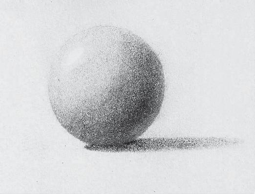
fIg 1-71. Study of value scales on sphere. Pencil on paper, 5 x 8 in Illustrated by Shima Rabiee
PLACEMENT
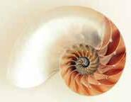
Situating an object or a space within a specific frame is called Placement. While observing an image, we do not look at all its points equally. Some points are more inviting to the eyes than others, and therefore they can play an important role in the image’s composition and its communicative purpose. It is common knowledge that many of these art principles thus discovered were actually originated within nature, which in turn offers the most beautiful and complete proportions and relations. The following images are just some from thousands of examples in nature which follow this rule (Figure 2-5).
2-5.
Artists too, after years of study and creating numerous works after being inspired by nature, have reached common conclusions about desirable dimensions and proportions. These ratios are thought to be the most aesthetically attractive, and create a notable balance and harmony when used that aid in manifesting comfort. Designer can use these proportions and ratios to present their ideas intentionally, in a way that will transpire their purpose.
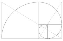
Knowing these proportion translates to knowing how the eye naturally feels most comfortable with them. However, this does not mean that these are necessary and unavoidable rules. They can be altered based on the designer’s purpose of communication, the image’s aesthetics, point of interest, and composition. Generally the three concepts that are in play in framing ratios and in the position of main subjects in the image are as follows:
1. Golden Ratio (Figure 2-6), 2. Golden Points (Figure 2-7), and 3. The rule of thirds (Figure 2-8).
fIg 2-6. Golden Ratio
fIg 2-7. Golden Point
fIg 2-8. The Rule of Thirds
fIg
Natural forms Photo credit to Pexels
Color is among the factors which, besides demonstrating the physical specification of objects and creating a sensual impression of space, can be effective in controlling values and composition, as well as in strengthening the three-dimensional sense of a space.
• Dimensions of Color:
To introduce color, we should first introduce the concepts of hue, saturation, and value which are the defining components of color.
Hue
Hue means the color itself, like yellow, blue, red, green, orange, purple, etc. and any other color which is the result of mixing different portions of these colors—such as bluegreen, light green which tends towards yellow, olive green, etc. Therefore, according to this definition and as it can be seen in the diagram below, there is an infinite number of colors or hues (Figure 2-28).
Value
Value is the degree of the color’s lightness or darkness, which is determined based on the extent of the mixture of the color in question with white or black. For example, the following diagrams show different values of green (Figure 2-29).
Saturation
Saturation is the extent of brilliance or dullness of a color. The percentage of the mixture of the color in question with the color gray, which can vary between 0 to 100 percent, determines the color’s saturation. To better understand the concept of saturation, the color green is shown with different saturation degrees in the following diagram (Figure 2-30).
fIg 2-28. Hue
fIg 2-29. Values of green
fIg 2-30. Saturation of green
Green
Green Green
White Gray Black
ISUAL WEIGHT AND MOVEMENT
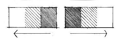
A good image is one that constantly plays with the viewer’s eyes and moves them across the page to discover its different points. A balanced and monotone image is less attractive and triggers less curiosity than one with more variety. Artists use tone variation as an effective approach for creating dynamism and disarranging visual weight. Tone variations make the eye linger longer on the darker points and move from there to lighter or simpler parts. For effectively controlling the Visual Weight of the image and creating movement, it is important to consider the following points:
• The natural tendency of the eye’s movement:
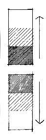
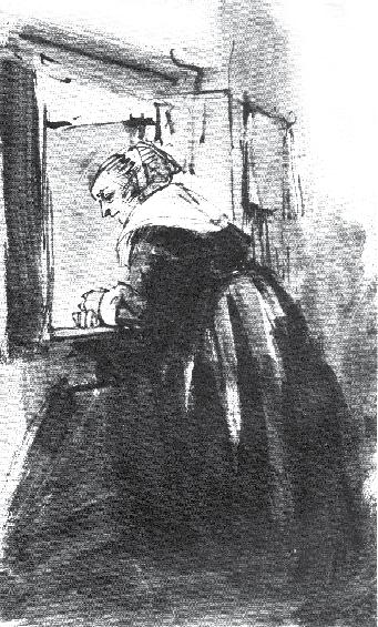
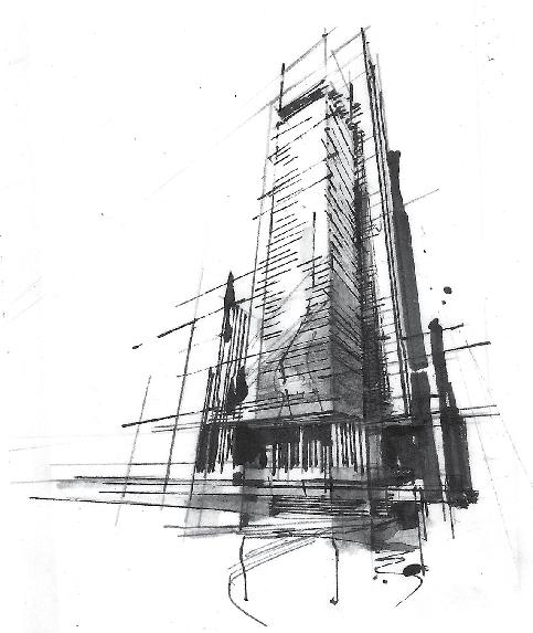
Research has shown that our eyes frequently tend to move towards a specific direction when looking at an image with equal tone values in all points. For example, the eye is more likely to move from the bottom to the top, and the left to the right than the other way around (Figure 2-61 and 2-62). Therefore, if the image reveals the information in the same direction towards which the eye has a greater tendency, it appears more balanced, pleasant, and beautiful to the eye. Of course there are other opposing opinions about the natural movement of the eye as well, but the main point here is rather the importance of the movement of the eye across the page which is encouraged by differing visual weights of the sides of the page, and not the direction of this movement. The following examples, Figure 2-63 and 2-64 exemplify this application of tone and visual weight variation from the bottom to the top in the images.
fIg 2-61.
fIg 2-61. Visual weight from the bottom to the top
fIg 2-62. Visual weight from the left to the right
fIg 2-64. Urban sketch
Pen and marker on paper, 8 1/2 x 11 in Illustrated by Shima Rabiee
fIg 2-63. Woman looking through window
Rembrandt Van Rijn(1606-1669)
Pen, brush and ink. 6 1/2 x 11 1/2 in The Louvre Museum
CHAPTER III:
PrIncIPlEs and ProcEss of VIsualIzatIon
The illustration process, involves different stages and procedures; which means that its development should be undertaken in different layers, with respect to the order of stages and with awareness of the principles, so that the resulting image turns out legible, purposeful, and expressive. Therefore, developing a deep understanding of these principles and using them properly and in the order is of great importance.
This chapter explores the steps for visualizing and developing a space in design studios. With important principles and factors of drawing and representation having been introduced in previous chapters, this chapter describes the application of these principles to visualization and rendering, providing step-by-step examples. These examples include both digital and freehand drawing techniques as well as their combinations. This chapter recommends taking eight following steps for the visualization of space in all techniques:
• Step 1: Setting the base
• Step 2: Analyzing the form and structure of the space
• Step 3: Applying colors and materials
• Step 4: Creating harmony and sense of unity
• Step 5: Revealing the three-dimensional form through implication of light and shadow
• Step 6: Enhancing the compositional structure
• Step 7: Expressing depth and spatial quality
• Step 8: Creating dynamics, movement, and energy
Understanding and applying these eight stages in visualization, regardless of the visualization technique, makes that visualization highly comprehensible, effective and expressive. In this chapter, we study how these factors can be effective in visualizing process and can contribute to the better understanding and presentation of the design intent.
TECHNIQUE I: DIGITAL-DIGITAL
stEP 5: rEVEalIng thE thrEE-dImEnsIonal form through implicAtion of light And shAdow
Applying lights and shadows is a very significant and effective stage in visualization. This is the most important stage after setting the base, because communicating the design form and composition as well as its atmosphere are undertaken in this stage Figure (3-24).
Despite the widely-held false belief, this stage is not merely confined to defining a light source and applying the shadows, but it is of higher importance and value. Here are some reasons for its significance:
• Light and shadow reveal the three-dimensional form of objects and their composition:
In fact, this is the stage where we can best communicate the three-dimensional form of objects, their position in space, and their composition. As in painting, where light and shadows contribute to the understanding of the form and composition of objects, in visualization too, the concept is better expressed and revealed with the aid of lights and shadows.
Applying shade and shadow
Increasing the intensity of light
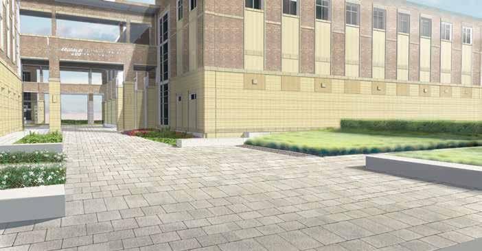
fIg 3-24. Revealing the three-dimensional form through implication of light and shadow, the fifth step of visualization Texas A&M University, TX, USA. Digital media, 11 x 17 in Illustrated by Shima Rabiee, Copyright to SWA Group
Design Visualization: Exploring
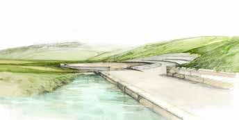
In the freehand-digital technique, the freehand drawing can be done with colored pencil, watercolor, pastel, marker or any other art medium. In this specific example of Westmoor Park, in Figure 3-67, marker has been used on velum paper. The paper’s texture has given the straight, rigid, and dry marker lines a sense of liquidity and has enhanced mixing the colors
Applying materials with freehand drawing
Westmoor Park, First Place National Design Competition, CT, USA Pen and marker on Vellum paper, 11 x 17 in Illustrated by Shima Rabiee, Copyright to Balsley Balsley Kuhl
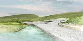
fIg 3-68. Applying materials in digital
Westmoor Park, First Place National Design Competition, CT, USA Mixed media (collage of freehand drawing and digital media), 11 x 17 in Illustrated by Shima Rabiee, Copyright to Balsley Balsley Kuhl
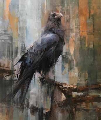
fIg 3-70. Raven ( The second layer of painting) Oil on Panel, 16 x 20 in Painted by Shima Rabiee
fIg 3-67.
fIg 3-69. Raven ( Underpainting: The first layer of painting) Oil on Panel, 16 x 20 in Painted by Shima Rabiee