Reflective Diary & Fashion Bible
By Mia Stead


By Mia Stead
Entering Component 2, I conducted a deep dive into Digital fashion brands to develop further from my research into Component 1.
I first came across the brand Auroboros after it made its way onto my FYP. The brand was founded by Lee ALexander McQueen; encapsulating characteristics such as innovation, sustainability and immersive deisgn. Their first ready to wear line’Biomimicry’ was showcased at London Digital Fashion Week ( the first didgital fashion show of its kind).
McQueen drew inspiration from the forces of nature, technology, sci-fi films and Animee to curate his 14 digital piece collection.
Auroboros’s pieces can also be sold through the digital clothing site ‘Dress X’. The company acts as a multi-brand retailer for digital fashion collections, with the introduction of influencer marketing schemes. Dress X’s success has reduced their campaign costs by 60%, ultimately driving towards a circualar world of sustainability.
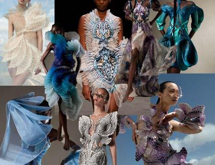
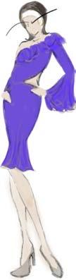
Even though this collection isnt digital pieces like Auroboros, the collection explores sustainability from a futuristic perspective, something I’m excited to develop on throughout this project. Herpen explores the depths of marine ecosytems and the preservation of the environemnt through the use of materials and aesthetics i.e. Soft draping fabric to almost webbed, string like material. Materials used were found from recyled plastic sourced from the Oceans, in order to make the pieces seem like a living oragnism. Herpen demonstrates this through earthy toned colour schemes and circle embroidery techniques.
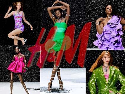
H&M acting as one of the worlds largest fast fashion brands, is actually leading the way into a sustainable fast fashion future.
The brand curates and promotes themed collections through online parties, digital dance floors and 3D filters such as AR virtual try on’s. H&M has also been trialling live stream shopping in order to guide and be interactive with the consumer as they can buy directly from the stream. This promottion/ selling techniques has become extremely popular with Gen Alpha since the rise of TikTok shop, which utilises the same techniques in order to enagage directly with the consumer.
After researching into digital fashion,Auroboros and Iris Van Herpen, highlighted ways I can future proof my designs ( which I experiment with later on).
These designs, showcase the importance of creating uncoventional designs within the market in order to attract consumers and showcase to them the future of fashion.
For when it comes to creating the deisgns that will feature as examples within Fruiture, I aim to trial mixing elements from all 3 researched brands to combine fast fashion, sustainability and the future.


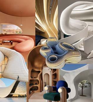
App layout and UI app assets: For this aspect, once again I was heavily influenced by retro-furtism. I drew upon Zahar Hadid’s architecture, ( sleek, circular formations, uncoventional and unique). this then carried through into UI app assets as I wanted the app to flow to be aesthetically pleasing. By utilsing, sleek circular features, the app will also be easier to navigate as it allows the consumers eyes to flow to the next component better.
Text and Slogans: For my main text, I chose Shrikhand, as it was curved itallics and almost bubble writing ( refers back to logo design). This typography would be utilised for headlines etc.
For main body text I chose Bebes Nue, this text is sleeker and more minamilist, which would allow the headline text, Shrikhand, to stand out when both texts are places nect to each other.
For slogan ideas, I wanted them to be playful and creative, like the brand, and almost like a play on words to incorporate sustainability. Some hashtags such as #OOTF ( outift of the fruit), plays upon a current trend ( outfit of the day), yet applies to what social media trends may look like if my ap was around in 2030.
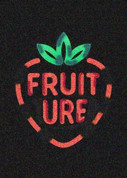
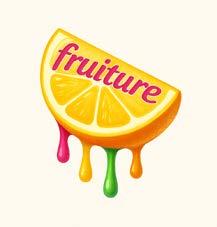
I first came up with the brand name ‘Fruiture’ after mind-mapping general ideas about the app. For the name of the brand I wanted something quick,snappy and easy to remember, yet also tells the consumer exactly what the brand does in approximately the first second of reading the name.
From Component 1, I was particularly interested within the development and use of fruit fibres within fashion, currently used within fashion houses such as Stella McCartney and Pangaia( typically a higher price point). So I came up with the brand Fruiture, based upon the concept of fruit fashion(sustainable) yet incorporates technology through the use of curating digital fashion pieces., in order to appeal to the Gen Alpha consumer in 2030.
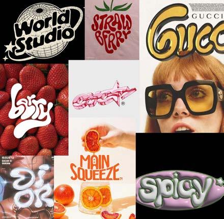
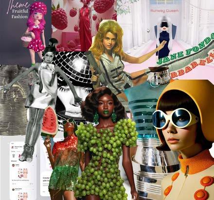
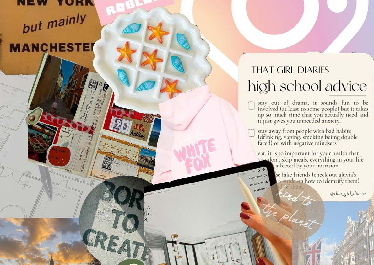
To begin with, I curated an aesthetic overview for the brand, collecting refernces to AI fruit fashion, Retro-furturistic fashion( another topic that has heavily influenced by project), AI scanning apps and Dress To Impress ( off the app Roblox). This element was successful, as it easily helped me to navigate the particular route I wanted to take when curating the brand’s identity.
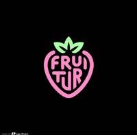
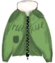
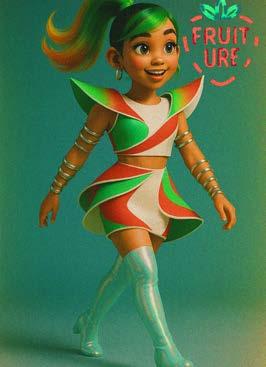
When researching into particular logos, I was heavily influenced by retro-furtistic texts,colours and logo’s in general. For Fruiture’s logo I wanted it to be bold, curved writing, potentially metallic etc.This aesthetic would help to carry the retro-futuristic aesthetic throughout the brand and project. I particularly liked the strawberry logo where the writing created the outline of the strawberry, so it will be interesting to see how I choose to dveelop it for Fruiture, whether its through a colour change etc.

After gatherig multiple logo’s, I then moved onto what my chosen colour scheme would be. I chose White, Neon Pink,Neon purple and Bio Lime. I initially chose these colours, based upon the sustainability aspect of the brand ( bio lime), Neon pink and purple, where then introduced to reinofrce retro-furtistic ideologies throughout the brand. I then chose White instead of Black to break up element of the deisgn ( to be utilised in text etc), As it interpretates as purity, innocence and younger charcteristics ( psychology of colour), which would hopefully encourage older Gen Alpha to still interact with the brand in 2030 when they are older. This reasoning, was then backed up by my research into WGSN. Neon colours= self expression,Y2K, 90s and youth driven styles. Good American’s launch of neon swimwear increased searched by 1080%, as well as this, Pacco Rabanne, pre-summer 2026 showcases pieces with metallics and neon blue.
As part of my research in Component 1 showcased that Gen Alpha’s retrofuturism may showcase a tech backlash rather than technology advancements, I thought it was key that some elements of my brand could showcase this concept.


As a reflection of my research into logos, I began by illustrating 3 logo designs that highlighted the brands voice ( sustainability,Fruit fashion, colourful and playful).
Initially, I took my designs into chatGPT and utilised prompts such as ‘hyper-realism’, ‘bright and colourful’ and ‘neon and retro-furturistic’.
I then came to the conclusion, that I wanted to then develop the strawberry logo further in order to create Fruiture’s logo. I chose this particular design, as I thought it was simplistic enough to not be overpowering, yet still encapsulate the brands identity in one logo that can be used trhoughout.
I then took the design into photoshop, in order to edit out the ‘T’ that was used twice. I then places the text to be alligned and central. From this, I then utilsed darker shades of colour to create depth witin the logo to make it feel more realistic. After breaking up the harsh outside line, to make the name the focus, I then trialled utilising ‘noise’ and various colour blending modes to achieve different colours, hues, brightness etc.
Overall, I think the finished logo is successful and will speak to the brands Gen Alpha consumer through the use of it’s bold and playful nature.
My initial idea for app layout design was based off previous moodboards ( Zahar Hadid Architecture & retro-futruism). My development so far has showcased bold, neon colours and retro-futruistic design ideas, so I wanted to continue this aesethetic into the design for the app.
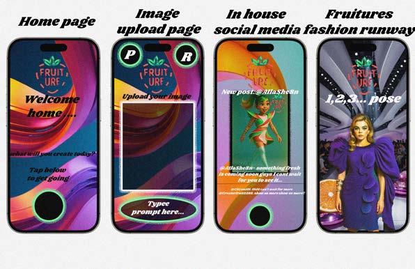
For the backgound created multiple AI generations based upon flowing circular formations with the incorporation of my colour scheme. I created a background for the home page and uploading page that was bold and powerful. I chose for these two to have the same background to show the constinuation of the brands ideology before your own personalised creation is made. For the in house social media, I then generated a background with similar architectual structures, but included more muted colour tones. The reasoning behind this, is for the consumers individual posts and designs to be the forefront rather than be overpowered by the brands background design.
Finally, for the runway section of the app. is once again heavily influenced by retro-futurism, I then added pops of colour by adding models of fruit onto the runway to reinforce the fact that all the designs being showcased are digital fruit fashion pieces.

For the UI app assets, I chose Black ciruclar assets to mimic a home screen button( Gen alpha, being digitally native, will find easy to navigate, I then chose to incorporate our branding by adding a bio lime glow around the buttons in order to draw attention to them.
For the layout, I also wanted to include the brand logo throughout all elements in the app. In some parts they are more visible i.e the home screen to create impact, whereas on the social media page once again the logo is more muted and hidden to allows the users designs to be at the forefront.
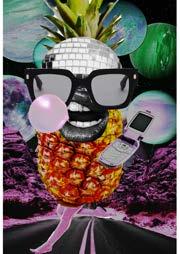
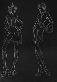
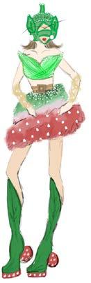
My first step when it came to deisgning the pieces that would be featured within the app , it began with curated fruit croquis. These were some of my favourite things to create throughout the project so far, to the point where I thought about making them into mascots for the app. However I decided to not go down this route as I wanted to focus on the actual fashion pieces instead, potentially these mascots are something that could be developed if the brand actually became a thing in 2030 for a poetntial promotional technique. However, these croqui’s do encapsulate what I wanted the illustartions to be( playful, youthful, bold and unique).
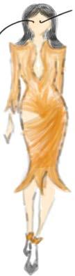
For the base of my designs i provided by gen Alpha cousin with a moodboard for the aesthetic of the brand she then came up with her interpretations of them. I thought this would provide me with a direct link to a Gen Alpha consumer and provide me with a deeper understanding of what she would want to create if she was a user herself. From this, I then took the designs into Photoshop, where i customised the deisgns ie sculptured bodices and introduced my chosen colour schemes. During this process, I also referred back to some of H&M’s metaverse pieces for a direct link to digital fast fashion.
After completing the initial designs to be featured within the app, I transitioned into researching and creating styled pieces to be paired with specific pieces and for other users to potentially buy digitally and wear on their pieces aswell.
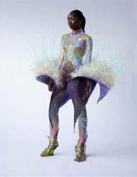
However, after some of the first AI generations to make the deisgns look hyperrealistic on models, I then came to the conclusion, that they werent as futuristic as they should be. I then took the deisgns back to the drawing board and generated new interpretations of the illustrations based upon some of Iris Van Herpen’s Earthrise collection, rather than just focusing on H&M and 60s retro futrusim influence.
This change and reflection in my designs were successful as I feel they now speak to a Gen alpha consumer in 2030, ( unique, bold and futuristic.
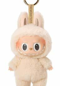
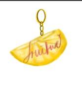
I began my research on WGSN, analysing textiles and silohouettes from the ‘womens textile forecast. WGSN’. This article showcased a development in sculptured draping,textured pleats, transparency / matte and shine contrasts. From this I then began to analyse trends for kid’s accessories also utilising WGSN. This article highlighted the rise of modular hoods, baseball caps, leg warmers and bag charms. This research then led to me gathering images that related to these predictions ie the current labubu trend, however, I also came across the brand Thoutfully hooded that is a small sustainable childrens brand that specilises in modular hood. After extablishing the current market, I decided to analyse what could be future trends based on now for 2030. Modular Hoods ( more inspired by the inluence of space, so the hood would be more transparent/ opaque almost inspired by a space helmet. The colour scheme would still be mainly greens to reinforce the sustainable aspect). Bag Charms( encouragement of personalisation, but will highlight an individuals personal/ political views more ie sustainability, which is why I created fruiture fruit bag charms rather than developing the previous fruit croqui into a charm/ mascot, as if the personalisation highlighted political values the tone should be a stronger and deeper meaning rather than a playful mascot.)
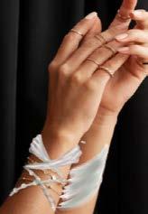
Finally, for jewellery, Iwanted to develop upon the chunky jewellery current trend, however for 2030 I thought they would becomes more sculptured and become more of a focal piece for an outift, i.e metallic draping/ architecture inspired. ( influenced by the Womens Textile Forecast. WGSN).
Before transitioning into the development of my campaigns for Fruiture, I wanted to evaluate and revisit the target audience and the development of my app.
Swot Analysis: Analysising Fruiture holistically helped me to establish what I could successfully promote to atract the consumer( eco-conscious, community, pushing the boundaries etc), but also to extablish where the weaknessess lay within the app ( a lack of awareness and under developed due to lack of testing ( as its not an actual app, just a concept). This process showed to me I can build off the strengths of what would attract a consumer and build a community which would ultimately build awareness, as well as this, if the app did go further ideas such as added features ie AR/VR and influencer marketing schemes could be incorporated.
Consumer profiles:
To show my consumer profile, I wanted to show through imagery the change of the consumer over time as we move closer to 2030. The start of the moodboard ( at the top) begins with Fruiture’s current consumer. 13 year old,female, North west location and enjoys socialising with frienfs whether in person or online gaming platforms, creative hobbies with a big online social media presence however a minimal purchasing habits.
this then intigrates with the future consumer ( bottom of the moodbaord) 28 year old female, London based architect, creative sould and grew up a digital native, eco-conscious with an online social presence and aim to minimise spending habits.
By creating a consumer for the current and future taregt audience, it showcased to me that as Gen alpha are still young even though they are politically aware they are still playful and want a space to be social without havung to go above their means( pocket money limiits), however as the app and the Gen Alpha consumer get older, that is when the app will begain to fully transition into a fully eco-conscious, sustianable consumer.


Social media trends are now everchanging, due to how much current generations rely on social media. Current social media trends are revolving around 1) an AI reveolution such as Meta AI and Snapchat Ai images. 2) Trend detox where brands are beginning to move away from small micro trends and utilise social listenting to predict longevity and increase authenticity. 3) UGC creation to showcase personlisity and create a community. Finally, 4) short attention span videos due to the rise of TikTok during Covid to the creation of Youtube Shorts. (Demeku.Hootsuite)
2030 prediction:
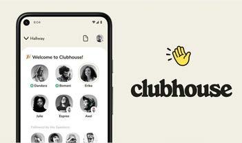
Within 2030, w e will see the rise of niche platforms that will create highly targeted audiences and build upon Gen Alpha’s desire for community, this is already seen within the app Clubhouse ( an audio social platform).
Ar advertisements blending with UGC creation.
AI chatbots- personalisation and trailored live videos and interactive posts in short form contentsuch as tiktok shop, AI lenses etc FOMO marketing and Behind the scenes.( engaement and exclusivity, similar to Zara’s marketing strategy researched in Component 1).However, these ideas could lead to an over satuated market and ad fatigue, due to the increae in micro trends. (Reachabovemedia.

By analysing current and predicted social media trends, it gave a clear idea of what promotional techniques I wanted to develop on for my own marketing strategy, such as how to utilise short form content to attract a consumer rather than leading to ad fatigue.
When establishing an influencer marketing strategy I originally explored multiple routes.1) Generating an AI influencer. A now growing strategy utilised within brand collaberations etc. Some famous influencers are Rozy, Lil Miquela etc. After establishing the current market, it came clear that by introducing an AI influencer to Fruiture would allow the influencer to be maluable towards every consumer, cost-effective and provide content without a time scale. However, AI influencer market can become over saturated, so Fruiture’s in house influencer would have to be unique from any other.
Myself as an influencer: I trialled this through AI generation( shown in the moobdoard) to show what potential UGC creation for the brand could look like towards a Gen ALpha consumer, however, I came to the conclusion that by utlilising myself (Gen Z) it would be more difficult for a Gen Alpha to relate to.
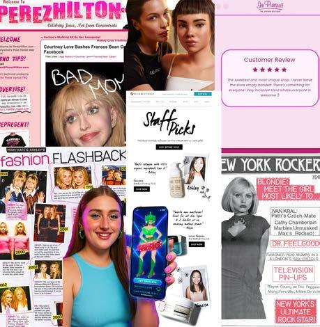
Gossip colums/ customer reviews: After exploring this topic in a previous lecture, I decided to develp on this further by researching into 90s gossip colums and 60s/70s gossip papers aswell, such as ‘Crazy Days & Nights’, Lainey Gossip’, ‘Perez Hilton’ etc that highlighted the chaoticness of Hollywood nightlife through hectic, party and overcrowded websites. From this, I researched ito why people like to gossip. Peng et al 2015 conducted a brain scan of men and women listening to positve and negative gossip about themselves, it highlighted activity in the pre-frontal cortex which navigate social behaviours and shwed that indiviuals then used this knowlege as power to fit in socially. As a reflection of this topic, Gossip colums and reviews could go either way with Gen Alpha, it would highlight transparency and in depth deatil, however, they would find it an untrustworthy source due to sterotypically being annoymous bloggers. However, rather than writing a fiull gossip colums as a technique for Fruiture, small short form content in the use of UGC short form content could be used instead.
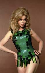
As a large influence into Fruiture is retrofuturism, which came around in the 60s, I decided to research into some of the 60s iconic influencers. These ranged from Cher,Jane Fond, The Supremes, Jackie Kennedy etc. As a trial for creating a 60s influencer, I based it around Jane Fonda, as I have already previously explored the film Barbarella. To begin with, I began creating images of a young jane Fonda. From this I then began to develop my previous designs onto the AI Jane Fonda. During this process of developing the designs onto the model, they initially looked like what was already in the market ( mini tight fitted dresses), From this I took a deeper influence from Iris Van Herpen Earthrise collection to give it more of a futurisic look. From this I then took the designs into Photoshop to add noise and colour grading, as well as adding the fruiture logo for constinuos branding.
Overall, This process was beneficial in helping me to establish prompts in ordee to create the best AI generations of my deisgns, yet I decided to go with an AI influencer for Fruiture for Gen Alpha to relate to more, as the majority wouldnt know and understand who Jane Fonda is.
I initially came up with the name Aila sheen after playing on incorporating ‘AI’ into the name. After creating a description for Aila (Pixar, animated, sustainable,playful,bold etc), I took it into Chatgpt. From this I then decided that as a development of the original Pixar animated avatar, I would create hyperrealistic verions aswell. I wanted to introduce this idea into Fruiture as when the app first launches and Gen ALpha is still young, Sheen will attract this target audience, however, as the app and the consumer grow older, so will Sheen to create authenticity and a more relatable influencer.
I then repeated the same process of developing my designs onto Sheen and introducting styling pieces( futuristic metallic jewellery), I then took the images into photoshop and conducted the same editing techniques.
Overall, I believe Sheen to be the perfect influencer for Fruiture as she encapsulates the brands identity. Within this development, I also decided that the designs I have created will feature as Sheen’s Capsule collection with Fruiture to act as a promotional technique. This is to help with attracting a varied audience from users interested in the app and users
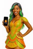

Creating a mock up of Aila Sheen’s ‘instsagram account’ to establish her own brand idenitity and also see how her promotions of the capsule collection would feature within the instagram.
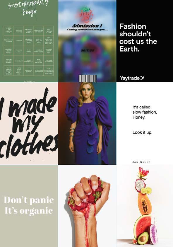
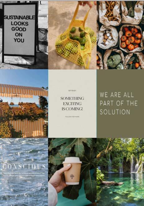
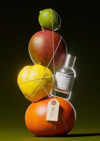
As a reflection of my previous research into social media trends, I curated a moodboard of promotional campiagns that stood out to me. The majority were heavily inlfuenced by fruit and would highlight a transition between the fruit image uploaded to the app and the deisgn of the clothing being formed ie the lipton ice tea and Heinz Ketchup. As a development from this, I then decided to revisit Pangaia and Stella McCartney campiagns that I explored within Component 1, as they are the movers and shakers wiithin the Fruit Fibre Fashion industry. However, instead of just looking at the social media campaigns I looked into their ecommerse (Panagai: Gen inspo section) and visual merchandising ( Stella McCartney: Illuminated massive mushrooms in the storefront).
After collecting this information into pormotional ideas for Fruiture, I created using photoshop an admission ticket for Fruiture’s pop up shop, This would act as technique that would highlight exclusivity and encourage impulse to visit and join the app as the pop up shop is hidden from the consumer.
From this, I then took it upon myself to create what I interepretated Fruiture’s instagram to look like. Intereactive posts such as ‘ sustainable bingo’ and the ‘ pop up shop teaser’, previous video campiagns ‘ the fruit tower and ASMR fruit’, to motivational sustainable goals and quotes to create a community and highlights the brrands voice and idenity.
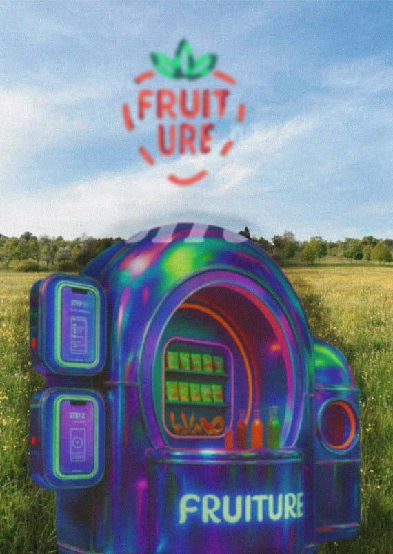
When it came to creating a pop up shop for Fruiture, I wanted it to be different and unique compared to every brand creating pop up shops these days. At first, I thought of creating digital pop ups to collaberate with schools for educational purposes, however, I chose not to develop this further as it would limit the community aspect that a pop up shop brings to only certain ages within the generation. Instead, I began by gathering imgaery of inspiration for the achitecture of the piece by looking into futuristic, space like pop ups. I then created an illsutration and chose what I wanted to sell and promote there ( fruit juices and seed bags) and then took into AI to create a digital version. After finalising a deisgn, I edited and developed within Photoshop. I places the shop onto a field background, as I decided rather than placing the shop in cities such as Manchester, the shop would appear in farmers land up and down the country to promote sustainablility. Any farmers willing to join, would provide their own produce aswell for the day and in return would 65% of all the profit made on that day.
Throughout this whole process the brand would continue to showcase sustainability and the imporatnce of fruit.
During thiis process, I also finalised my timeline and contingency plan. After speaking to multiple industury members throughout this project, they highlighted the imporatnce of always having a back up plan for a campaign/project. For me this element is important in making sure all campaigns are released promptly and to have backup plans i.e utilsining AI generated videos if my own primary video clips arent as successful.
Cinematic Storytelling: The art of using visuals, sound and editing to create an immersive and engaging narrative experience for the audience.
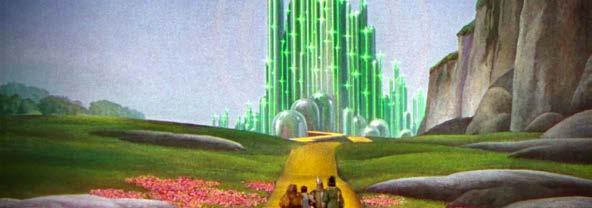
For my final piece for my project, I decided I want to create two videos, one a detailed cinematic piece and the other being a ‘day in the life’ of using the app to show UGC creation. However, throughout both videos I wanted to create the same retrofutuistic aesthetic. After looking into Barbarella, I came across the colour grading technique of Technicolour, that was utilised in films like the Wizard of Oz and allowed colour to be added to B/W films. The aesethic is Bold, vivid and visual colours that are over exaggerated and often surreal. This is a technique I aim to explore further with into Component 3 to develop my content with.
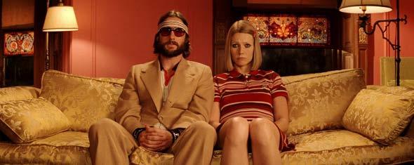
I also looked into Wes Anderson who is famous for his colour grading in films like the Royal Tenanbaaus and Fantastic Mr Fox, with utilsing Psychology of Colour and warm red and yellow colours.
Psychology of Colour:
Within cinematography, utilising psychology of colour helps to evoke subconscious reactions and their symbolic meaning. During my research into psychology of colour I continued research into Wizard of Oz, which begins in a sepia themed Kanzas and transitions inot a technicolour Oz, this highlights a shift in emotion and narrative for the audience. On the other hand, Great Gatsby utilises green and cold to show opulance, greed and wealth.
My aim is to use similar colour graiding techniques to Wizard of Oz and highlight sepia to technicolour transitions to highlight the before and after or using Fruiture.
For my final campiagn videos I wanted to create storyboards to capture every element.
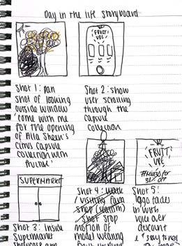
Day in the life: Utilsing my sister or cousin as the UGC creator in the video ( gen alpha), varied shots and angles of the phone featuring the screen pages shown previously. Locations: In a home and also Booths ( Farmers market inspired supermarket)
Highlight Gen alpha’s love for UGC creation, continue brands voice throughout, showcase Aila Sheen capsule collection through the phone screen or posters.
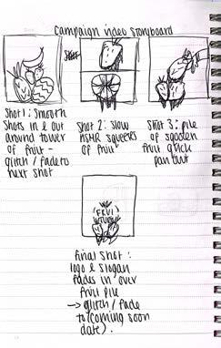
Campiagn video:
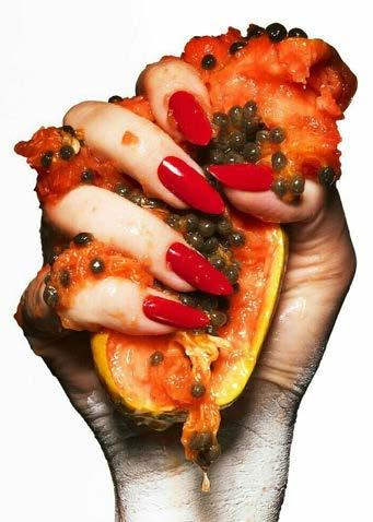
Cinematic shots of varied fruits, Squeeze, drips, zoom ins etc.
Captivate the audience, the imporatnce of fruit within the brand.
Thomas.2021. Colour Intelligence: Neons. WGSN Colour Intelligence: Neons - WGSN Fashion Design

Palmer.2025.Womens textile forecast s/s 27:kintentional.WGSN Women’s Textiles Forecast S/S 27: Kintentional - WGSN Fashion Design
Dugal.2021.The CFDA partners with personal styling app Alta. Fashionabc
The CFDA Partners With Personal Styling App Alta - fashionabc
Sills.2021.Why people like to gossip.PsychologyToday. Why People Like to Gossip | Psychology Today
2021.Iris Van Herpen recycles plastic waste into sculptural garments. Thursd.
Iris van Herpen Recycles Plastic Waste Into Sculptural Garments
GuilBault.2025.Jonathon Anderson’s debuts diors next chapter in Paris.VogueBusiness. https://www.voguebusiness.com/story/fashion/jonathan-andersondebuts-diors-next-chapter-in-paris
‘A journey of how can we push the boundaries?’: Demna reflects on his decade at Balenciaga | Vogue Business

In Pictures: Jeff Bezos and Lauren Sanchez wedding in Venice - BBC News https://www.galialahav.com/blogs/news/a-sparkling-celebration-inlondon-galia-lahav-s-content-creators-event