9 minute read
Page Laughlin

Story by TOVIEW PAGE LAUGHLIN’S work is to Andy enter a world of illusion. On the surface, her lush, visually sumptuous
Advertisement
Coughlan paintings are decorative and colorful. But what lies below the surface is one key to discovering the illusions on offer. Instead of the usual canvas or panel, Laughlin’s rich oil rests uneasily on a thin surface of Mylar, a fragile plastic most usuallyfound in food packaging.
“The vast majority of my work has been on canvas and on panels,” Laughlin said, in an email interview. “I was searching for a presentation for my paintings that would bring a ‘light-ness’ that serves as a counterpoint to the lush surface, and as a foil to the illusion of depth in the paintings. As a painter, I am always interested in creating illusions and breaking them, as well.”
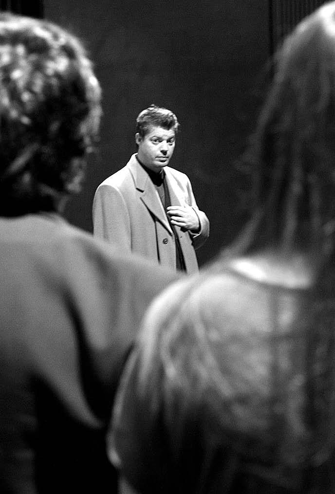
“Hidden Worlds; Paintings by Page Laughlin,” a 15piece exhibition, is on display at The Dishman Art Museum at Lamar University through Oct. 21. The paintings are inspired by photos of interiors culled from popular homes magazines.
Jessica Dandona, director of the Dishman, worked at North Carolina’s Wake Forest University where Laughlin teaches.
“I have always been very drawn to her work, both in terms of their beauty and in terms of the intellectual questions they pose,” Dandona said. “Page starts with the glossy high-end home magazines that we like to peruse over coffee on the weekends. She starts with something like “Architectural Digest” and she re-interprets the scenes she finds there.”
Dandona said Laughlin works on a couple of different levels.
“On one hand she creates this very finely crafted, hand-made work that is in and of itself a luxury product, like the products that are in these magazines,” she said. “But she then subverts that in a couple of interesting ways. First of all, she chooses to do oil painting on Mylar, a kind of plastic which is inherently fragile and is also relatively inexpensive. It’s something that we associate with commercial products and industrialization. So already you can see her getting away from this idea of a precious, rare object and playing with that idea.
“The Mylar makes the work seem less substantial. So you have these layers and layers and layers of paint accumulated over a year or more — so much time and effort has gone into this work — and yet it is on this very impermanent material that can be easily creased. It’s fragile.”
Dandona said her interpretation of Laughlin’s work is to think of these interiors as not an actual inside, as an expression of what the people who actually live in them are truly like, but, in a way, as a kind of elaborate façade —areversal of inside and outside.
“She underscores the artificiality of these created spaces through the pictorial choices that she makes,” Dandona said. “The other thing that she does is to focus in on the telling detail of the scene. Often, these will be decorative details that employ the bodies of people of color in a decorative way. I know that sounds mysterious, but what I mean by that is that she makes us aware of the strangeness of choice to have a candlestick in the PARROTS AND PLATES by Page Laughlin
shape of a black woman’s body, and thus prompts us to consider how objects construct meaning all around us.
“Her challenge to the viewer, then, is to consider how the choices we make about our own visual environment might sometimes produce meanings that, upon reflection, are problematic.”
Laughlin sends messages about how our environment sends messages about who we are and what we believe. Some of those messages can be destructive, Dandona said.
“It’s not about any particular race, it’s about why we would consider it quaint to turn another person’s body into wallpaper as a sign of refinement. In fact, it’s asserting a position of power in relationship to that body. You are suggesting that you can use it for your own pleasure, just as we might use an actual body.”
Even though Laughlin’s work gives the appearance of thickness, there are sometimes small areas of the Mylar that are left unpainted so viewers can actually see through to the wall behind.
“I love that because it creates that sense of insubstantiality, that these are images, that they are illusion — it takes their sense of presence and solidity and permanence away,” Dandona said. “It says these are illusions that we create and throw up to evoke an aura of refinement. But they are impermanent, like all things.”
Mylar is non-absorbent so it may take a year for the oil paint to dry. Laughlin had to make the decision on which ones to send to the Dishman based on whether they were dry or not, Dandona said.
Laughlin’s work is lush and richly detailed.
“I have always been attracted to seductive paintings,” she said. “I love the process of painting and
dynamic compositions.
InRussia, artists and poets often were members of the same art group, and, therefore, collaborations between them were common. The text was often experimented with in the same way as objects of the material world in painting. Words were broken up into rudimentary components and then reconstructed in a new fashion, like objects in a Cubist work. Some artists focused on the graphic image of the word or letter and re-shaped it in search of a new meaning. Others focused on the phonetic characteristics and experimented with fonts to achieve a number of visual and audio effects.
In this context, “For the Voice” should be seen as one of the ultimate achievements in book design which characterized the Russian avant-garde movement and also one its final achievements. The time of the freedom of artistic experimentation was running out as the Soviet state continued its imminent course towards dictatorship.
What is it that makes “For the Voice” so special? The first thing that most writers on this subject point out is the amazing unity between Mayakovsky’s poems and Lissitzky’s design. While in most illustrated books images serve to complement the text, Lissitzky’s imagery is an integral part of Mayakovsky’s poems and is intertwined with the words and the structure of the verse. Creative use of fonts, transformation of words into pictograms, colorcoding of words and letters to convey the intonation with which they should be read, visual metaphors and icons which guide the reader from page to page — these are only few devices used by Lissitzky.
“My pages stand in much the same relationship to the poem as an accompanying piano to a violin. Just as the poet in his poem unites concept and sound, I have tried to create an equivalent unity using the poem and typography,” wrote Lissitzky about collaboration with Mayakovsky in his book “Typographical Facts” (1925.)
Adistinctive feature of the book is the thumb index along the right margin of the page. This is a standard codex book form which has existed for centuries, and is mostly familiar today by such prosaic publications as phonebooks and catalogues. The thumb index serves a practical purpose, making it easy to find each poem. However, it is also a powerful metaphor which expresses the modernist nature of the book. Little squares with abbreviated titles and icons that convey the main idea of each poem bring to mind simultaneously fragmented Cubist paintings and the constructivist spirit of the time.
To better understand the ingenuity of Lissitzky’s design, let’s take a close look at the opening poem of the book, titled “Left March.” Here is the beginning of the poem:
Form ranks! Forward march! No squabbling ad nauseum. Silence, speakers! Your password is Comrade Mauser. No more ancient laws! Eve and Adam are dead. We’ll break history’s old horse. By the left! Left! Left! The poem “Left March,” above, in “For the Voice,” a collaboration between the poet Vladimir Mayakovsky, and the artist El Lissitzky.
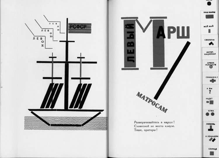
Mayakovsky was on the way to address a group of sailors. This is a revolutionary poem in which the structure and the rhythm of the verse conjure visual and sound effects of a military parade: lines and lines of marching sailors, the drumbeat, the abrupt “barking” of the military commands. Included as the “banner poem” in the book published in 1923 in Berlin, it was supposed to impress the Russian emigrant community with the might of the young socialist state as well as to alert them — and Europeans — to the inevitability of the world revolution.
Lissitzky conveys associations with a military parade by designing the capital letter M of the word “march” as a whimsical triumphal arch: two monumental columns with an elegant v-shaped connection. For the Russian public, as well as the emigrant community, this image immediately evoked memories of celebrations of the October Revolution anniversary and other socialist holidays, with columns of soldiers and sailors passing under historic triumphal arches as they marched down ancient squares of Moscow and Petrograd.
In the next stanza, Mayakovsky references the realities of the sailor’s life, which, like ordinary objects of everyday life in a Cubist composition, are separated from their context and elevated to the level of a symbol:
Hey, blueshirts, stride the seas!
Soar high!
Or else have your battleships’ keels lost their cutting edge?
Let the crowned British lion snarl and roar his best.
We’ll defend the Commune.
By the left!
Left!
Left! ing of a battleship, with the flag bearing the inscription “RSFSR” (Russian Soviet Federal Socialist Republic.) The repeated word “left” echoes the frequent repetition of this word in the poem. The word itself is broken into two parts and is inscribed along the jagged lines on the left side of the ship, creating a visual counterpart to the acoustic evocation of the “barking” sounds of the military command in the poem.
The most curious effect created by Lissitzky is, unfortunately, “lost in translation.” The Russian word “left” (“levoi”), when broken into two syllables, sounds like two separate words: “lev” (lion) and “voi” (roar.) Mayakovsky exploited this plasticity of the language to create the metaphor of the snarling and roaring British lion. Using the Cubist device of fragmentation, Lissitzky spelled the two syllables separately, thus making it a realized metaphor.
Each of the thirteen poems has its own intricate graphic devices which make the reader pause and contemplate. As Lissitzky stated himself, “the possibilities of two-color printing (overlays, cross-hatching and so on) have been exploited to the full.” He realized that the poems were meant to be read aloud and searched for the best ways to indicate to the reader what words should be emphasized, where the voice should be toned down and where it should rise in crescendo almost to a shout.
Almost 90 years have passed since “For the Voice” was published. Today, with the benefit of knowing what happened in the Soviet Union during the 60 years of the socialist regime, few people will agree with Mayakovsky who furiously attacked Russian emigrants in Berlin, most of whom did not deserve accusations of being unpatriotic and were literally forced out of the country. Those who chose not to return to Russia, despite the success of the Berlin exhibition, chose wisely.
However, the cadence of Mayakovsky’s verse combined with Lissitzky’s ingenious graphic design continues to serve as an example of one of the highest artistic achievements in the history of the avant-garde book.